[1]:
%run ../initscript.py
HTML("""
<div id="popup" style="padding-bottom:5px; display:none;">
<div>Enter Password:</div>
<input id="password" type="password"/>
<button onclick="done()" style="border-radius: 12px;">Submit</button>
</div>
<button onclick="unlock()" style="border-radius: 12px;">Unclock</button>
<a href="#" onclick="code_toggle(this); return false;">show code</a>
""")
[1]:
[2]:
%run ../../notebooks/loadtsfuncs.py
%matplotlib inline
toggle()
[2]:
Time Series Data
Time series is a sequence of observations recorded at regular time intervals with many applications such as in demand and sales, number of visitors to a website, stock price, etc. In this section, we focus on two time series datasets that one is the US houses sales and the other is the soft drink sales.
Read and Plot Data
The python package pandas is used to read .cvs data file. The first 5 rows are shown as below.
[3]:
df_house.head()
[3]:
| sales | year | month | |
|---|---|---|---|
| date | |||
| 1991-01-01 | 401 | 1991 | Jan |
| 1991-02-01 | 482 | 1991 | Feb |
| 1991-03-01 | 507 | 1991 | Mar |
| 1991-04-01 | 508 | 1991 | Apr |
| 1991-05-01 | 517 | 1991 | May |
[4]:
df_drink.head()
[4]:
| sales | year | quarter | |
|---|---|---|---|
| date | |||
| 2001-03-31 | 1807.37 | 2001 | Q1 |
| 2001-06-30 | 2355.32 | 2001 | Q2 |
| 2001-09-30 | 2591.83 | 2001 | Q3 |
| 2001-12-31 | 2236.39 | 2001 | Q4 |
| 2002-03-31 | 1549.14 | 2002 | Q1 |
There are univariate and multivariate time series where - A univariate time series is a series with a single time-dependent variable, and - A Multivariate time series has more than one time-dependent variable. Each variable depends not only on its past values but also has some dependency on other variables. This dependency is used for forecasting future values.
Our datasets are univariate time series. Time series data can be thought of as special cases of panel data. Panel data (or longitudinal data) also involves measurements over time. The difference is that, in addition to time series, it also contains one or more related variables that are measured for the same time periods.
Now, We plot the time series data
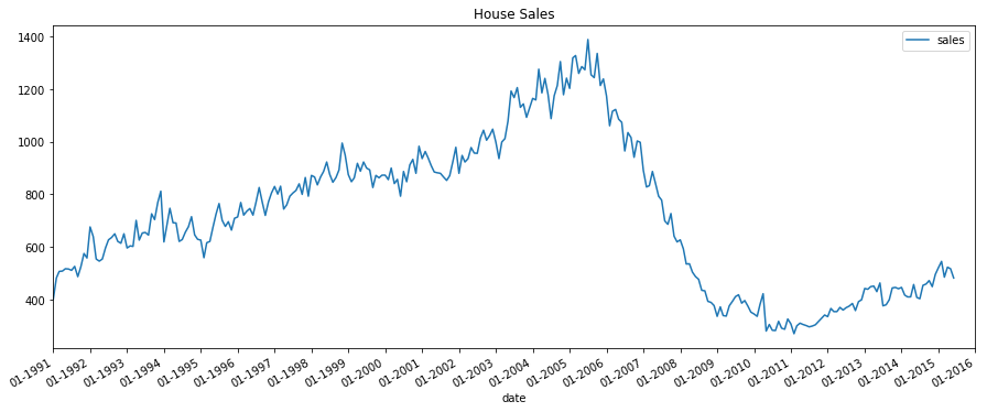
[5]:
plot_time_series(df_house, 'sales', title='House Sales')
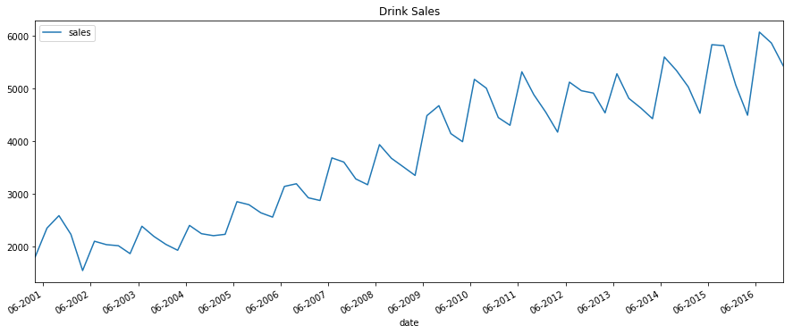
[6]:
plot_time_series(df_drink, 'sales', title='Drink Sales')
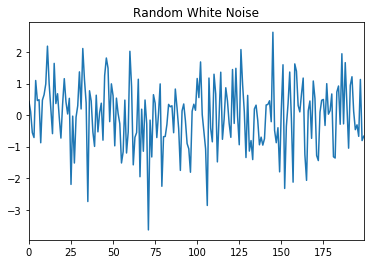
White Noise
A time series is white noise if the observations are independent and identically distributed with a mean of zero. This means that all observations have the same variance and each value has a zero correlation with all other values in the series. White noise is an important concept in time series analysis and forecasting because:
Predictability: if the time series is white noise, then, by definition, it is random. We cannot reasonably model it and make predictions.
Model diagnostics: the series of errors from a time series forecast model should ideally be white noise.
[7]:
pd.Series(np.random.randn(200)).plot(title='Random White Noise')
plt.show()
Random Walk
The series itself is not random. However, its differences - that is, the changes from one period to the next - are random. The random walk model is
and the difference form of random walk model is
where \(\mu\) is the drift. Apparently, the series tends to trend upward if \(\mu > 0\) or downward if \(\mu < 0\).
[8]:
interact(random_walk, drift=widgets.FloatSlider(min=-0.1,max=0.1,step=0.01,value=0,description='Drift:'));
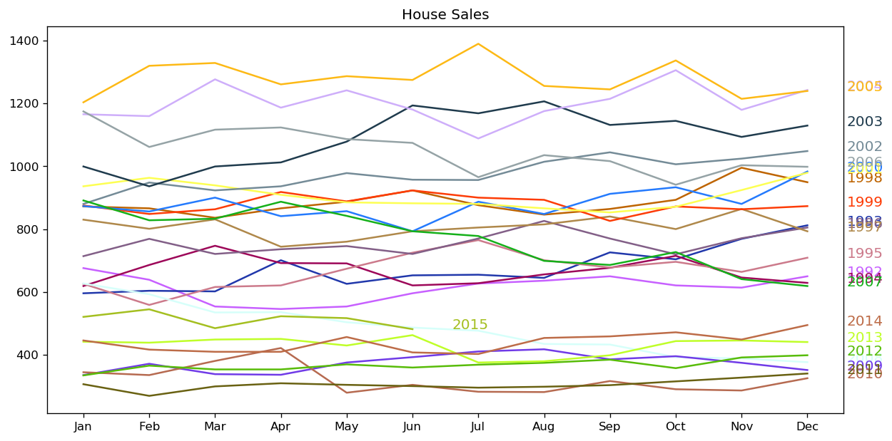
Seasonal Plot
The datasets are either a monthly or quarterly time series. They may follows a certain repetitive pattern every year. So, we can plot each year as a separate line in the same plot. This allows us to compare the year-wise patterns side-by-side.
[9]:
seasonal_plot(df_house, ['month','sales'], title='House Sales')
[10]:
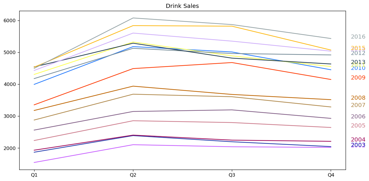
seasonal_plot(df_drink, ['quarter','sales'], title='Drink Sales')
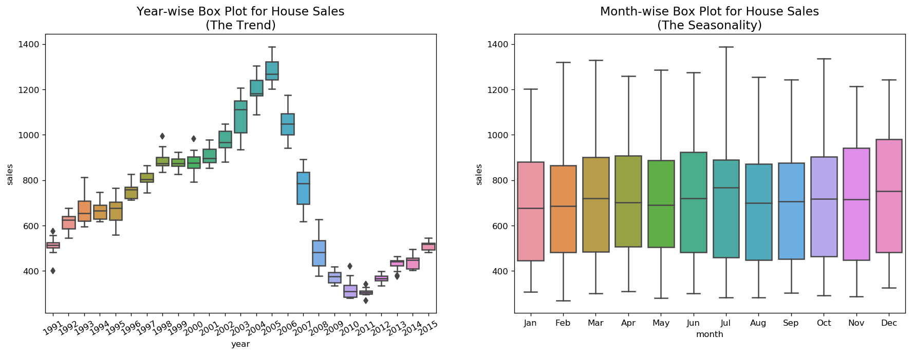
For house sales, we do not see a clear repetitive pattern in each year. It is also difficult to identify a clear trend among years.
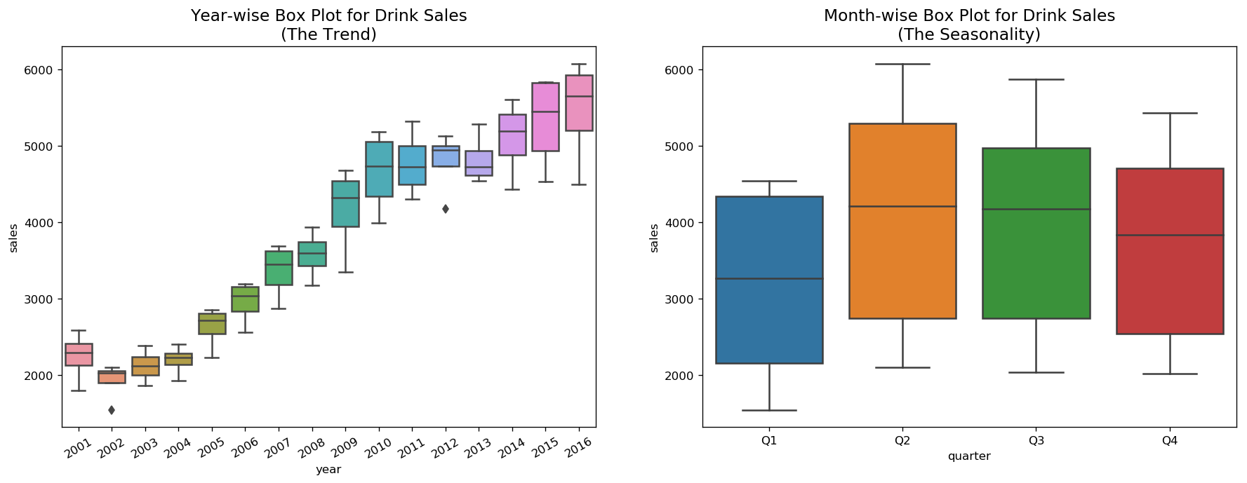
For drink sales, there is a clear pattern repeating every year. It shows a steep increase in drink sales every 2nd quarter. Then, it is falling slightly in the 3rd quarter and so on. As years progress, the drink sales increase overall.
Boxplot of Seasonal and Trend Distribution
We can visualize the trend and how it varies each year in a year-wise or month-wise boxplot for house sales, as well as quarter-wise boxplot for drink sales.
[11]:
boxplot(df_house, ['month','sales'], title='House Sales')
[12]:
boxplot(df_drink, ['quarter','sales'], title='Drink Sales')
Smoothen a Time Series
Smoothening of a time series may be useful in: - Reducing the effect of noise in a signal get a fair approximation of the noise-filtered series. - The smoothed version of series can be used as a feature to explain the original series itself. - Visualize the underlying trend better
Moving average smoothing is certainly the most common smoothening method.
[13]:
interact(moving_average, span=widgets.IntSlider(min=3,max=30,step=3,value=6,description='Span:'));
There are other methods such as LOESS smoothing (LOcalized regrESSion) and LOWESS smoothing (LOcally Weighted regrESSion).
LOESS fits multiple regressions in the local neighborhood of each point. It is implemented in the statsmodels package, where we can control the degree of smoothing using frac argument which specifies the percentage of data points nearby that should be considered to fit a regression model.
[14]:
interact(lowess_smooth, frac=widgets.FloatSlider(min=0.05,max=0.3,step=0.05,value=0.05,description='Frac:'));