[1]:
%run ../initscript.py
HTML("""
<div id="popup" style="padding-bottom:5px; display:none;">
    <div>Enter Password:</div>
    <input id="password" type="password"/>
    <button onclick="done()" style="border-radius: 12px;">Submit</button>
</div>
<button onclick="unlock()" style="border-radius: 12px;">Unclock</button>
<a href="#" onclick="code_toggle(this); return false;">show code</a>
""")
[1]:
[2]:
%run loadregfuncs.py
import warnings
warnings.filterwarnings('ignore')
%matplotlib inline
toggle()
[2]:
Regression Estimation
We consider a simple example to illustrate how to use python package statsmodels to perform regression analysis and predictions.
Case: Manufacture Costs
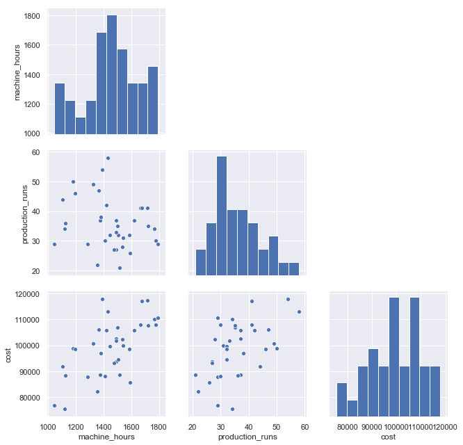
A manufacturer wants to get a better understanding of its costs. We consider two variables: machine hours and production runs. A production run can produce a large batch of products. Once a production run is completed, the factory must set up for the next production run. Therefore, the costs include fixed costs associated with each production run and variable costs based on machine hours.
Scatterplot (with regression line and mean CI) and time series plot are presented:
[3]:
df = pd.read_csv(dataurl+'costs.csv', header=0, index_col='month')
def draw_scatterplot(x, y):
    fig, axes = plt.subplots(1, 2, figsize = (12,6))
    sns.regplot(x=df[x], y=df[y], data=df, ax=axes[0])
    axes[0].set_title('Scatterplot: X={} Y={}'.format(x,y))
    df[y].plot(ax=axes[1], xlim=(0,40))
    axes[1].set_title('Time series plot: {}'.format(y))
    plt.show()

interact(draw_scatterplot,
         x=widgets.Dropdown(options=df.columns,value=df.columns[0],
                            description='X:',disabled=False),
         y=widgets.Dropdown(options=df.columns,value=df.columns[2],
                            description='Y:',disabled=False));

g=sns.pairplot(df, height=3);
for i, j in zip(*np.triu_indices_from(g.axes, 1)):
    g.axes[i, j].set_visible(False)

toggle()
[3]:
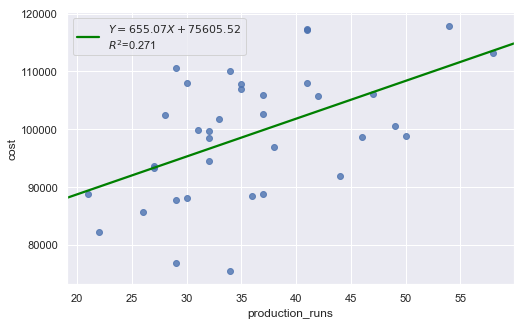
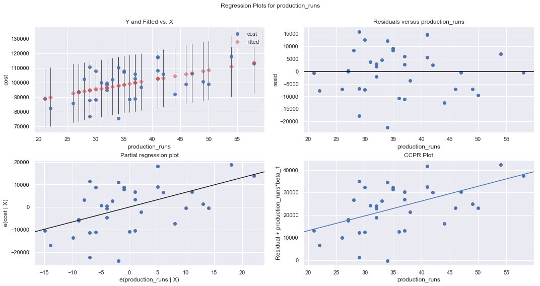
We regress costs against production runs with formula:
which is a simple regression because of only one explanatory variable.
[4]:
df = pd.read_csv(dataurl+'costs.csv', header=0, index_col='month')
result = analysis(df, 'cost', ['production_runs'], printlvl=5)

fig = plt.figure(figsize=(15,8))
fig = sm.graphics.plot_regress_exog(result, "production_runs", fig=fig);
| Dep. Variable: | cost | R-squared: | 0.271 |
|---|---|---|---|
| Model: | OLS | Adj. R-squared: | 0.250 |
| Method: | Least Squares | F-statistic: | 12.64 |
| Date: | Fri, 24 May 2019 | Prob (F-statistic): | 0.00114 |
| Time: | 16:23:25 | Log-Likelihood: | -379.62 |
| No. Observations: | 36 | AIC: | 763.2 |
| Df Residuals: | 34 | BIC: | 766.4 |
| Df Model: | 1 | ||
| Covariance Type: | nonrobust |
| coef | std err | t | P>|t| | [0.025 | 0.975] | |
|---|---|---|---|---|---|---|
| Intercept | 7.561e+04 | 6808.611 | 11.104 | 0.000 | 6.18e+04 | 8.94e+04 |
| production_runs | 655.0707 | 184.275 | 3.555 | 0.001 | 280.579 | 1029.562 |
| Omnibus: | 0.597 | Durbin-Watson: | 2.090 |
|---|---|---|---|
| Prob(Omnibus): | 0.742 | Jarque-Bera (JB): | 0.683 |
| Skew: | -0.264 | Prob(JB): | 0.711 |
| Kurtosis: | 2.580 | Cond. No. | 160. |
Warnings:
[1] Standard Errors assume that the covariance matrix of the errors is correctly specified.
standard error of estimate:9457.23946


ANOVA Table:
| sum_sq | df | F | PR(>F) | |
|---|---|---|---|---|
| production_runs | 1.130248e+09 | 1.0 | 12.637029 | 0.001135 |
| Residual | 3.040939e+09 | 34.0 | NaN | NaN |
KstestResult(statistic=0.5, pvalue=7.573316153566455e-09)
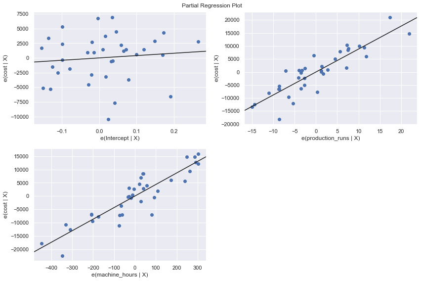
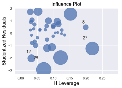
We perform a multiple regression on costs against both explanatory variables (production runs and machine hours) by using formula:
[5]:
df = pd.read_csv(dataurl+'costs.csv', header=0, index_col='month')
result = analysis(df, 'cost', ['production_runs','machine_hours'], printlvl=5)

fig = plt.figure(figsize=(12,8))
fig = sm.graphics.plot_partregress_grid(result, fig=fig);

fig = plt.figure(figsize=(10,8))
fig = sm.graphics.influence_plot(result,criterion="cook", fig=fig);
| Dep. Variable: | cost | R-squared: | 0.866 |
|---|---|---|---|
| Model: | OLS | Adj. R-squared: | 0.858 |
| Method: | Least Squares | F-statistic: | 107.0 |
| Date: | Fri, 24 May 2019 | Prob (F-statistic): | 3.75e-15 |
| Time: | 16:23:26 | Log-Likelihood: | -349.07 |
| No. Observations: | 36 | AIC: | 704.1 |
| Df Residuals: | 33 | BIC: | 708.9 |
| Df Model: | 2 | ||
| Covariance Type: | nonrobust |
| coef | std err | t | P>|t| | [0.025 | 0.975] | |
|---|---|---|---|---|---|---|
| Intercept | 3996.6782 | 6603.651 | 0.605 | 0.549 | -9438.551 | 1.74e+04 |
| production_runs | 883.6179 | 82.251 | 10.743 | 0.000 | 716.276 | 1050.960 |
| machine_hours | 43.5364 | 3.589 | 12.129 | 0.000 | 36.234 | 50.839 |
| Omnibus: | 3.142 | Durbin-Watson: | 1.313 |
|---|---|---|---|
| Prob(Omnibus): | 0.208 | Jarque-Bera (JB): | 2.259 |
| Skew: | -0.609 | Prob(JB): | 0.323 |
| Kurtosis: | 3.155 | Cond. No. | 1.42e+04 |
Warnings:
[1] Standard Errors assume that the covariance matrix of the errors is correctly specified.
[2] The condition number is large, 1.42e+04. This might indicate that there are
strong multicollinearity or other numerical problems.
standard error of estimate:4108.99309


ANOVA Table:
| sum_sq | df | F | PR(>F) | |
|---|---|---|---|---|
| production_runs | 1.948557e+09 | 1.0 | 115.409712 | 2.611395e-12 |
| machine_hours | 2.483773e+09 | 1.0 | 147.109602 | 1.046454e-13 |
| Residual | 5.571662e+08 | 33.0 | NaN | NaN |
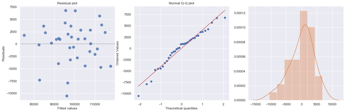
KstestResult(statistic=0.5833333333333333, pvalue=3.6048681911998855e-12)
<Figure size 720x576 with 0 Axes>
Statistical Inferences
The regression output includes statistics for the regression model:
\(R^2\) (coefficient of determination) is an important measure of the goodness of fit of the least squares line. Formula for \(R^2\) is
where \(\overline{Y}\) is the mean of the observed data with \(\overline{Y} = 1/n \sum Y_i\) and \(\hat{Y}_i = a+b X\) is the fitted value.
It is the percentage of variation of the dependent variable explained by the regression.
It always ranges between 0 and 1. The better the linear fit is, the closer \(R^2\) is to 1.
\(R^2\) is the square of the multiple R, i.e., the correlation between the actual \(Y\) values and the fitted \(\hat{Y}\) values.
\(R^2\) can only increase when extra explanatory variables are added to an equation.
If \(R^2\) = 1, all of the data points fall perfectly on the regression line. The predictor \(X\) accounts for all of the variation in \(Y\).
If \(R^2\) = 0, the estimated regression line is perfectly horizontal. The predictor \(X\) accounts for none of the variation in \(Y\).
Adjusted \(R^2\) is an alternative measure that adjusts \(R^2\) for the number of explanatory variables in the equation. It is used primarily to monitor whether extra explanatory variables really belong in the equation.
Standard error of estimate (\(s_e\)), also known as the regression standard error or the residual standard error, provide a good indication of how useful the regression line is for predicting \(Y\) values from \(X\) values.
\(F\) statistics reports the result of \(F\)-test for the overall fit where the null hypothesis is that all coefficients of the explanatory variables are zero and the alternative is that at least one of these coefficients is not zero. It is possible, because of multicollinearity, to have all small \(t\)-values even though the variables as a whole have significant explanatory power.
Also, for each explanatory variable:
std err: reflects the level of accuracy of the coefficients. The lower it is, the higher is the level of accuracy
\(t\)-values for the individual regression coefficients, which is \(t\)-\(\text{value} = \text{coefficient}/\text{std err}\).
\(P >|t|\) is p-value. A p-value of less than 0.05 is considered to be statistically significant
When the p-value of a coefficient is greater or equal than 0.05, we don’t reject the null hypothesis \(H_0\): the coefficient is zero. The following two realities are possible:
We committed a Type II error. That is, in reality the coefficient is nonzero and our sample data just didn’t provide enough evidence.
There is not much of a linear relationship between explanatory and dependent variables, but they could have nonlinear relationship.
When the p-value of a coefficient is less than 0.05, we reject the null hypothesis \(H_0\): the coefficient is zero. The following two realities are possible:
We committed a Type II error. That is, in reality the coefficient is zero and we have a bad sample.
There is indeed a linear relationship, but a nonlinear function would fit the data even better.
Confidence Interval \([0.025, 0.975]\) represents the range in which our coefficients are likely to fall (with a likelihood of 95%)
R-squared
Since \(R^2\) is the square of a correlation, it quantify the strength of a linear relationship. In other words, it is possible that \(R^2 = 0\%\) suggesting there is no linear relation between \(X\) and \(Y\), and yet a perfect curved (or “curvilinear” relationship) exists.
[6]:
x = np.linspace(-5, 5, 10)
y = x*x
df = pd.DataFrame({'X':x,'Y':y})
result = ols(formula="Y ~ X", data=df).fit()

fig, axes = plt.subplots(1,1,figsize=(5,4))
_ = sns.regplot(x=df.X, y=df.Y, data=df, ci=None, ax=axes)

plt.ylim(-5, 30)
axes.text(0.6, 28, 'R-squared = %0.2f' % result.rsquared)
axes.text(0.6, 25, 'Correlation = %0.2f' % np.sqrt(result.rsquared))
plt.show()
toggle()
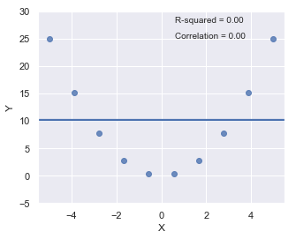
[6]:
\(R^2\) can be greatly affected by just one data point (or a few data points).
[7]:
x = np.linspace(-5, 5, 5)
y = -1.5*x + 1*np.random.normal(size=5)
y[4] = 50
df = pd.DataFrame({'X':x,'Y':y})
res = ols(formula="Y ~ X", data=df).fit()

fig, axes = plt.subplots(1,2,figsize=(12,6))
_ = sns.regplot(x=df.X, y=df.Y, data=df, ci=None, ax=axes[0])
axes[0].text(-4, 48, 'R-squared = %0.2f' % res.rsquared)
axes[0].text(-4, 45, 'Correlation = %0.2f' % np.sqrt(res.rsquared))

xx = x[:4]
yy = y[:4]
df = pd.DataFrame({'X':xx,'Y':yy})
res = ols(formula="Y ~ X", data=df).fit()
_ = sns.regplot(x=df.X, y=df.Y, data=df, ci=None, ax=axes[1])
axes[1].text(-4, 48, 'R-squared = %0.2f' % res.rsquared)
axes[1].text(-4, 45, 'Correlation = %0.2f' % np.sqrt(res.rsquared))
axes[1].plot(x[4], y[4], 'bo')

plt.show()
toggle()
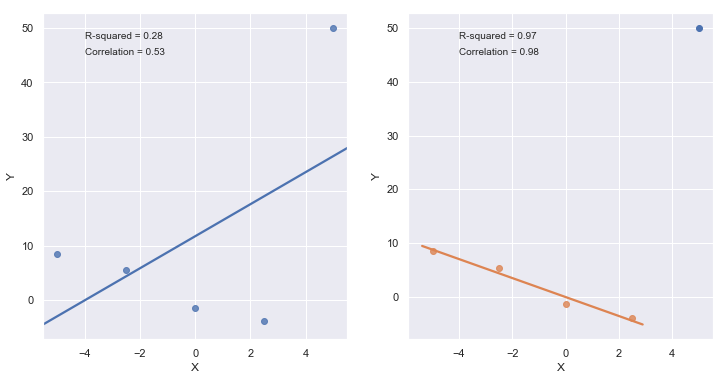
[7]:
A large \(R^2\) value should not be interpreted as meaning that the estimated regression line fits the data well. Another function might better describe the trend in the data.
[8]:
x = np.linspace(1, 5, 20)
y = np.power(x,3)
df = pd.DataFrame({'X':x,'Y':y})
res = ols(formula="Y ~ X", data=df).fit()

fig, axes = plt.subplots(1,1,figsize=(6,6))
_ = sns.regplot(x=df.X, y=df.Y, data=df, ci=None, ax=axes)
axes.text(1, 120, 'R-squared = %0.2f' % res.rsquared)
plt.title('Data generated by equation $Y = X^3$')
plt.show()
toggle()
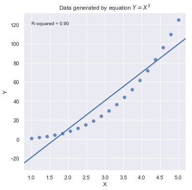
[8]:
Because statistical significance does not imply practical significance, large \(R^2\) value does not imply that the regression coefficient meaningfully different from 0. And a large \(R^2\) value does not necessarily mean the regression model can provide good predictions. It is still possible to get prediction intervals or confidence intervals that are too wide to be useful.
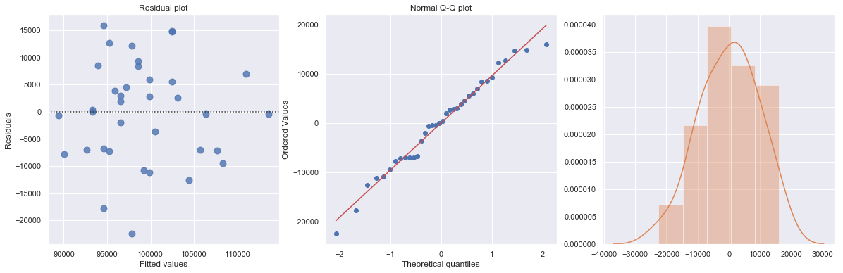
Residual Plot
Residual plot checks whether the regression model is appropriate for a dataset. It fits and removes a simple linear regression and then plots the residual values for each observation. Ideally, these values should be randomly scattered around \(y = 0\).
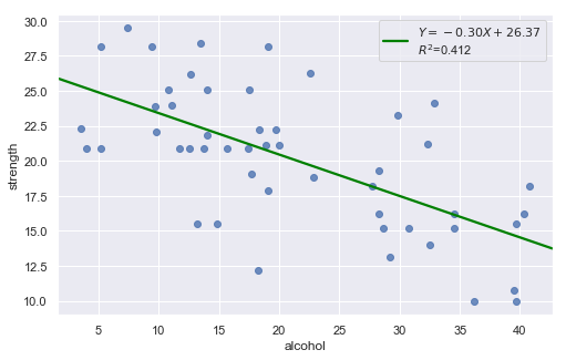
A “Good” Plot
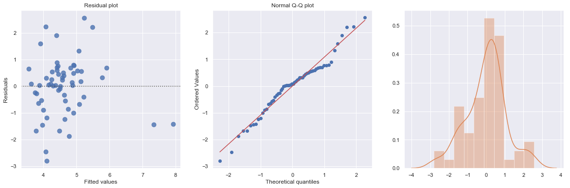
Example: The dataset includes measurements of the total lifetime consumption of alcohol on a random sample of n = 50 alcoholic men. We are interested in determining whether or not alcohol consumption was linearly related to muscle strength.
[9]:
df = pd.read_csv(dataurl+'alcoholarm.txt', delim_whitespace=True, header=0)
result = analysis(df, 'strength', ['alcohol'], printlvl=2)

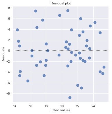
The scatter plot (on the left) suggests a decreasing linear relationship between alcohol and arm strength. It also suggests that there are no unusual data points in the data set.
This residual (residuals vs. fits) plot is a good example of suggesting about the appropriateness of the simple linear regression model
The residuals “bounce randomly” around the 0 line. This suggests that the assumption that the relationship is linear is reasonable.
The residuals roughly form a “horizontal band” around the 0 line. This suggests that the variances of the error terms are equal.
No one residual “stands out” from the basic random pattern of residuals. This suggests that there are no outliers.
In general, you expect your residual vs. fits plots to look something like the above plot. Interpreting these plots is subjective and many first time users tend to over-interpret these plots by looking at every twist and turn as something potentially troublesome. We should not put too much weight on residual plots based on small data sets because the size would be too small to make interpretation of a residuals plot worthwhile.
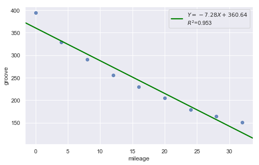
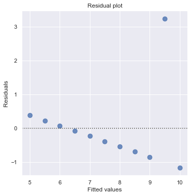
Nonlinear Relationship
Example: Is tire tread wear linearly related to mileage? As a result of the experiment, the researchers obtained a data set containing the mileage (in 1000 miles) driven and the depth of the remaining groove (in mils).
[10]:
df = pd.read_csv(dataurl+'treadwear.txt', sep='\s+', header=0)
result = analysis(df, 'groove', ['mileage'], printlvl=2)
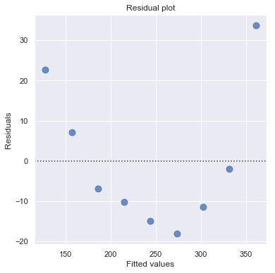
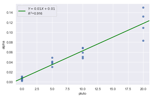
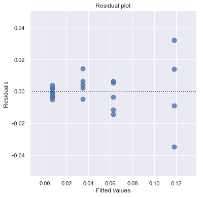
Non-constant Error Variance
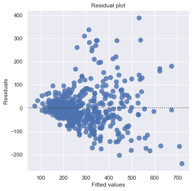
Example: How is plutonium activity related to alpha particle counts? Plutonium emits subatomic particles — called alpha particles. Devices used to detect plutonium record the intensity of alpha particle strikes in counts per second. The dataset contains 23 samples of plutonium
[11]:
df = pd.read_csv(dataurl+'alphapluto.txt', sep='\s+', header=0)
result = analysis(df, 'alpha', ['pluto'], printlvl=2)
[12]:
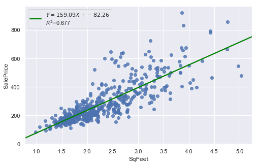
df = pd.read_csv(dataurl+'realestate.txt', sep='\s+', header=0)
result = analysis(df, 'SalePrice', ['SqFeet'], printlvl=2)
Outliers
[13]:
df = pd.read_csv(dataurl+'anscombe.txt', sep='\s+', header=0)
result = analysis(df, 'y3', ['x3'], printlvl=2)
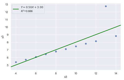
An alternative to the residuals vs. fits plot is a residuals vs. predictor plot. It is a scatter plot of residuals on the y axis and the predictor values on the \(x\)-axis. The interpretation of a residuals vs. predictor plot is identical to that for a residuals vs. fits plot.
Normal Q-Q Plot of Residuals
Normal Q-Q plot shows if residuals are normally distributed by checking if residuals follow a straight line well or deviate severely.
A “Good” Plot
[14]:
df = pd.read_csv(dataurl+'alcoholarm.txt', sep='\s+', header=0)
result = analysis(df, 'strength', ['alcohol'], printlvl=3)
KstestResult(statistic=0.3217352865304308, pvalue=4.179928356341629e-05)
More Examples
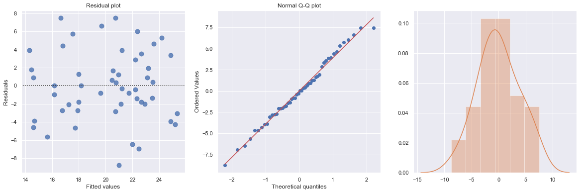
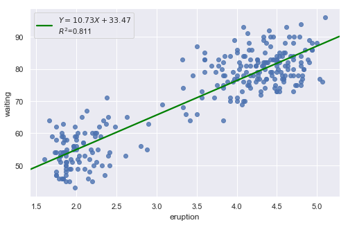
Example 1: A Q-Q plot of the residuals after a simple regression model is used for fitting ‘time to next eruption’ and ‘duration of last eruption for eruptions’ of Old Faithful geyser which was named for its frequent and somewhat predictable eruptions. Old Faithful is located in Yellowstone’s Upper Geyser Basin in the southwest section of the park.
[15]:
df = pd.read_csv(dataurl+'oldfaithful.txt', delim_whitespace=True, header=0)
result = analysis(df, 'waiting', ['eruption'], printlvl=3)
KstestResult(statistic=0.3748566542043297, pvalue=7.87278404247441e-35)
How to interpret?
[16]:
hide_answer()
[16]:
The histogram is roughly bell-shaped so it is an indication that it is reasonable to assume that the errors have a normal distribution. The pattern of the normal probability plot is straight, so this plot also provides evidence that it is reasonable to assume that the errors have a normal distribution.
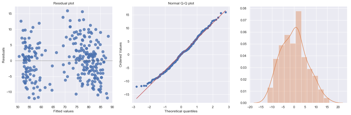
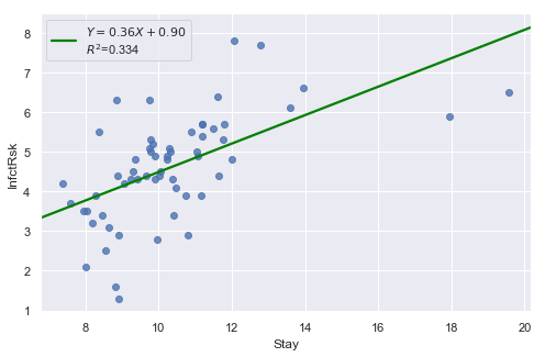
Example 2: The data contains ‘infection risk in a hospital’ and ‘average length of stay in the hospital’.
[17]:
df = pd.read_csv(dataurl+'infection12.txt', delim_whitespace=True, header=0)
result = analysis(df, 'InfctRsk', ['Stay'], printlvl=3)
KstestResult(statistic=0.11353657481026463, pvalue=0.39524100803555084)
How to interpret?
[18]:
hide_answer()
[18]:
The plot shows some deviation from the straight-line pattern indicating a distribution with heavier tails than a normal distribution. Also, the residual plot shows two possible outliers.
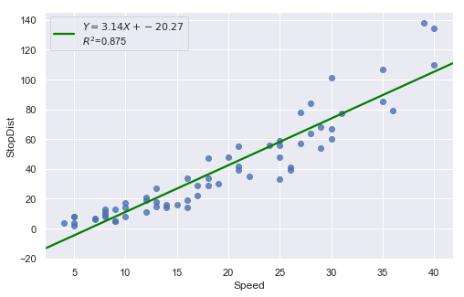
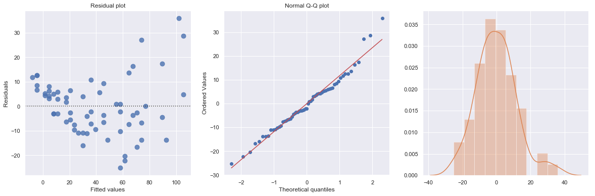
Example: A stopping distance data with stopping distance of a car and speed of the car when the brakes were applied.
[19]:
df = pd.read_csv(dataurl+'carstopping.txt', delim_whitespace=True, header=0)
result = analysis(df, 'StopDist', ['Speed'], printlvl=3)
KstestResult(statistic=0.49181308907235927, pvalue=1.3918967453080744e-14)
How to interpret?
[20]:
hide_answer()
[20]:
Fitting a simple linear regression model to these data leads to problems with both curvature and nonconstant variance. The nonlinearity is reasonable due to physical laws. One possible remedy is to transform variable(s).