[1]:
%run ../initscript.py
HTML("""
<div id="popup" style="padding-bottom:5px; display:none;">
    <div>Enter Password:</div>
    <input id="password" type="password"/>
    <button onclick="done()" style="border-radius: 12px;">Submit</button>
</div>
<button onclick="unlock()" style="border-radius: 12px;">Unclock</button>
<a href="#" onclick="code_toggle(this); return false;">show code</a>
""")
[1]:
[2]:
%run loadregfuncs.py
from ipywidgets import *
import warnings
warnings.filterwarnings('ignore')
%matplotlib inline
toggle()
[2]:
Estimating Relationships
The relationship between circumference and diameter is known to follow the exact equation
\begin{equation} \text{circumference $= \pi$ $\times$ diameter} \end{equation}
However, such a deterministic (or functional) relationship is not our interests. We are interested in statistical relationships, in which the relationship between the variables is not perfect. For example, we might be interested in the relationship between rainfall and product sales, or between the mortality due to skin cancer and state latitude.
Scatterplots provide graphical indications of relationships, whether they are linear, non-linear or even nonexistent. Correlation \(\rho\) is a numerical summary measures that indicate the strength of linear relationships between pairs of variables.
If \(\rho\) = -1, then there is a perfect negative linear relationship between \(X\) and \(Y\).
If \(\rho\) = 1, then there is a perfect positive linear relationship between \(X\) and \(Y\).
If \(\rho\) = 0, then there is no linear relationship between \(X\) and \(Y\).
Scatterplots are useful for indicating linear relationships and demonstrate its strength visually. However, they do not quantify the relationship. For example, a scatterplot could show a strong positive relationship between rainfall and product sales. But a scatterplot does not specify exactly what this relationship is. For example, what is the sales amount if the rainfall is, says, 4 inches?
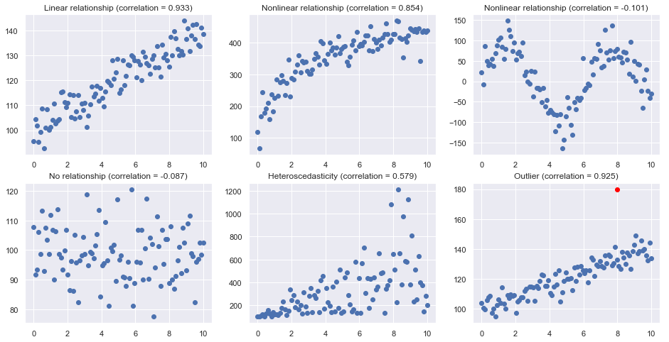
Scatterplots
Here are some typical scatterplots
[3]:
size=100
nrows=2
ncols=3

np.random.seed(123)

plt.subplots(nrows, ncols, figsize = (16,8))
plt.subplot(nrows, ncols, 1)
x = np.linspace(0, 10, size)
y = 100 + 4*x+ 4*np.random.normal(size=size)
plt.title("Linear relationship (correlation = {:.3f})".format(np.corrcoef(x,y)[0,1]))
plt.plot(x, y, 'o');
plt.subplot(nrows, ncols, 2)
x = np.linspace(0, 10, size)
y = 100 + 100*np.log(3*x+1)+ 30*np.random.normal(size=size)
plt.title("Nonlinear relationship (correlation = {:.3f})".format(np.corrcoef(x,y)[0,1]))
plt.plot(x, y, 'o');
plt.subplot(nrows, ncols, 3)
x = np.linspace(0, 10, size)
y = 100*np.sin(x) + 30*np.random.normal(size=size)
plt.title("Nonlinear relationship (correlation = {:.3f})".format(np.corrcoef(x,y)[0,1]))
plt.plot(x, y, 'o');
plt.subplot(nrows, ncols, 4)
x = np.linspace(0, 10, size)
y = 100 + 10*np.random.normal(size=size)
plt.title("No relationship (correlation = {:.3f})".format(np.corrcoef(x,y)[0,1]))
plt.plot(x, y, 'o');
plt.subplot(nrows, ncols, 5)
x = np.linspace(0, 10, size)
y = 100 + 3*x+ abs(50*x*np.random.normal(size=size))
plt.title("Heteroscedasticity (correlation = {:.3f})".format(np.corrcoef(x,y)[0,1]))
plt.plot(x, y, 'o');
plt.subplot(nrows, ncols, 6)
x = np.linspace(0, 10, size)
y = 100 + 4*x+ 5*np.random.normal(size=size)
plt.title("Outlier (correlation = {:.3f})".format(np.corrcoef(x,y)[0,1]))
plt.plot(x, y, 'o');
plt.plot(8, 180, 'o', c='red')

plt.show()

toggle()
[3]:
Correlation
correlation only quantifies the strength of a linear relationship (see example in section of R-squared).
correlation can be greatly affected by just one data point (see example in section of R-squared).
correlation can be greatly affected after aggregation.
[4]:
age   = [10, 10, 20, 20, 30]
score = [15, 39, 20, 43, 35]
df = pd.DataFrame({'age':age,'score':score})
print('Data:\n',df)
print('correlation:',np.corrcoef(df.age, df.score)[0,1], '\n')

df = df.groupby('age').mean().reset_index()
print('Aggregated Data:\n',df)
print('correlation:',np.corrcoef(df.age, df.score)[0,1])
toggle()
Data:
    age  score
0   10     15
1   10     39
2   20     20
3   20     43
4   30     35
correlation: 0.27831712743147

Aggregated Data:
    age  score
0   10   27.0
1   20   31.5
2   30   35.0
correlation: 0.9974059619080593
[4]:
Freedman, Pisani and Purves (1997) investigated data from the 1988 Current Population Survey and considered the relationship between a man’s level of education and his income. They calculated the correlation between education and income in two ways:
First, they treated individual men, aged 25-64, as the experimental units. That is, each data point represented a man’s income and education level. Using these data, they determined that the correlation between income and education level for men aged 25-64 was about 0.4, not a convincingly strong relationship.
The statisticians analyzed the data again, but in the second go-around they treated nine geographical regions as the units. That is, they first computed the average income and average education for men aged 25-64 in each of the nine regions. They determined that the correlation between the average income and average education for the sample of n = 9 regions was about 0.7, obtaining a much larger correlation than that obtained on the individual data.
The correlation calculated on the region data tends to overstate the strength of an association. How do you know what kind of data to use — aggregate data (such as the regional data) or individual data? It depends on the conclusion you’d like to make.
If you want to learn about the strength of the association between an individual’s education level and his/her income, then by all means you should use individual data. On the other hand, if you want to learn about the strength of the association between a school’s average salary level and the schools graduation rate, you should use aggregate data in which the units are the schools.
Case: Sales Prediction
Suppose we are trying to predict next month’s sales. We probably know a lots of factors from the weather to a competitor’s promotion to the rumor of a new and improved model can impact the sales. Perhaps your colleagues even have theories: “Trust me. The more rain we have, the more we sell” or “Six weeks after the competitor’s promotion, sales jump”.
To perform a regression analysis, the first step is to gather the data on the variables in question. Suppose we have all of monthly sales number for the past three years and some independent variables we are interested in. Let’s say we consider the average monthly rainfall for the past three years as one of the independent variables.
Glancing at this data, the sales are higher on days when it rains a lot, but by how much? The regression line can answer this question. In addition to the line, we also have a formula in the form of \begin{equation} Y = a + b X \nonumber \end{equation}
The formula shows - Historically, when it didn’t rain, we made an average of \(a\) sales, and - in the past, for every additional inch of rain, we made an average of \(b\) more sales.
However, regression is not perfectly precise to model the real world so the formula we need keep in mind is
\begin{equation} Y = a + b X + \text{residual}\nonumber \end{equation}
where residual is the vertical distance from a point to the line.
[5]:
app = LinRegressDisplay()
app.container
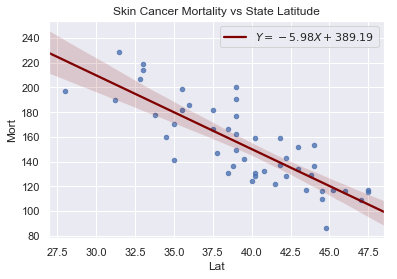
Case: Skin Cancer
The data includes the mortality due to skin cancer (number of deaths per 10 million people) and the latitude (degrees North) at the center of each of 49 states in the U.S. (The data were compiled in the 1950s, so Alaska and Hawaii were not yet states, and Washington, D.C. is included in the data set even though it is not technically a state.)
The scatterplot suggests that if you lived in the higher latitudes of the northern U.S., the less exposed you’d be to the harmful rays of the sun, and therefore, the less risk you’d have of death due to skin cancer. There appears to be a negative linear relationship between latitude and mortality due to skin cancer, but the relationship is not perfect. Indeed, the plot exhibits some “trend,” but it also exhibits some “scatter.” Therefore, it is a statistical relationship, not a deterministic one.
[6]:
df = pd.read_csv(dataurl+'skincancer.txt', sep='\s+', header=0)
slope, intercept, r_value, p_value, std_err = stats.linregress(df.Lat,df.Mort)
sns.regplot(x=df.Lat, y=df.Mort, data=df, marker='o',
                line_kws={'color':'maroon',
                          'label':"$Y$"+"$={:.2f}X+{:.2f}$".format(slope, intercept)},
                scatter_kws={'s':20})

plt.legend()
plt.title('Skin Cancer Mortality vs State Latitude')
plt.show()
toggle()
[6]:
[7]:
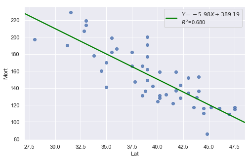
df = pd.read_csv(dataurl+'skincancer.txt', sep='\s+', header=0)
result = analysis(df, 'Mort', ['Lat'], printlvl=1)
[8]:
df = pd.read_csv(dataurl+'alligator.txt', sep='\s+', header=0)
result = analysis(df, 'weight', ['length'], printlvl=1)
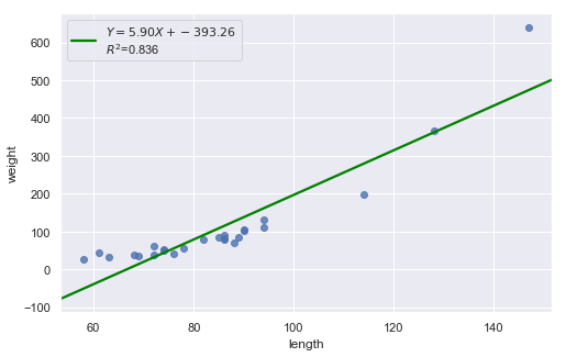
Consider the above two plots where one is about skin cancer mortality, and the other is about the weight and length of alligators. What is your assessment?
[9]:
hide_answer()
[9]:
It appears as if the relationship between latitude and skin cancer mortality is indeed linear, and therefore it would be best if we summarized the trend in the data using a linear function.
However, for the dataset of alligators, a a curved function would more adequately describe the trend. The scatter plot gives us a pretty good indication that a linear model is inadequate in this case.