[1]:
%run initscript.py
%run ./files/loadregfuncs.py
HTML("""
<div id="popup" style="padding-bottom:5px; display:none;">
    <div>Enter Password:</div>
    <input id="password" type="password"/>
    <button onclick="done()" style="border-radius: 12px;">Submit</button>
</div>
<button onclick="unlock()" style="border-radius: 12px;">Unclock</button>
<a href="#" onclick="code_toggle(this); return false;">show code</a>
""")
[1]:
Applied Regression Analysis
Regression Assumptions
As one of the most important types of data analysis, regression analysis is a way of mathematically sorting out factors that may have an impact. It focuses on questions:
Which factors matter most?
Which can we ignore?
How do those factors interact with each other?
Perhaps most importantly, how certain are we about all of these factors?
Those factors are called variables, and we have
Dependent (or response or target) variable: the main factor that you’re trying to understand or predict
Independent (or explanatory or predictor) variables: the factors you suspect have an impact on your dependent variable
Generally, regression model finds a line that fits the data “best” such that \(n\) residuals — one for each observed data point — are as small as possible in some overall sense. One way to achieve this goal is to use the “ordinary least squares (OLS) criterion,” which says to “minimize the sum of the squared prediction errors.”
What does the line estimate?
When looking to summarize the relationship between predictors \(X\) and a response \(Y\), we are interested in knowing the relationship in the population. The only way we could ever know it, though, is to be able to collect data on everybody in the population — most often an impossible task. We have to rely on taking and using a sample of data from the population to estimate the population regression line.
Therefore, several assumptions about the population are required to use sample regression line to estimate population regression line — statistical inference in a regression context.
Regression assumptions: 1. There is a population regression line. It joints the means of the dependent variable for all values of the explanatory variables, the mean of the errors is zero. 2. For any values of the explanatory variables, the variance (or standard deviation) of the dependent variable is a constant, the same for all such values. 3. For any values of the explanatory variables, the dependent variable is normally distributed. 4. The errors are probabilistically independent.
These assumptions represent an idealization of reality. From a practical point of view, if they represent a close approximate to reality, then the analysis is valid. But if the assumptions are grossly violated, statistical inferences that are based on these assumptions should be viewed with suspicion.
First Assumption
Let \(Y\) be the dependent variable and there are \(k\) explanatory variables \(X_1\) through \(X_k\). The assumption implies that there is an exact linear relationship between the mean of all \(Y\)’s for any fixed values of \(X\)’s and the \(X\)’s.
[2]:
interact(draw_sample,
         flag=widgets.Checkbox(value=False,description='Show Sample',disabled=False),
         id=widgets.Dropdown(options=range(1,4),value=1,description='Sample ID:',disabled=False));
Suppose we have population as shown in the plot. For example, \(X\) is the years of college education and \(Y\) is the annual salary. Given years of education, there is a range of possible salaries for different individuals.
The first assumption says, for each \(X\), the mean of \(Y\)s (\(=\overline{Y}\)) lies on the maroon line \(\overline{Y} = 3.08 X + 9.87\), which is the population regression line joining means. For each data point, its \(Y\) value is expressed by the population regression line with error \(Y = 3.08 X + 9.87 + \epsilon\) where \(\epsilon\) is the deviation of the data point to the maroon line.
Note that since the population is not accessible, the population regression (maroon) line is not observable in reality.
[3]:
interact(draw_sample,
         flag=widgets.Checkbox(value=True,description='Show Sample',disabled=False),
         id=widgets.Dropdown(options=range(1,4),value=1,description='Sample ID:',disabled=False));
The estimated regression line as shown in orange is based on the sample data, which is usually different from the population regression line. The regression lines derived from the first two samples are largely deviated from the population regression line.
Note that an error \(\epsilon\) is not quite the same as a residual \(e\). An error is the vertical distance from a point to the (unobservable) population regression line. A residual is the vertical distance from a point to the estimated regression line.
Second Assumption
The second assumption requires constant error variance, technical term is homoscedasticity. This assumption is often questionable because the variation in \(Y\) often increases as \(X\) increases. For example, the variation of spending increases as salary increases. We say the data exhibit heteroscedasticity (nonconstant error variance) if the variability of \(Y\) values is larger for some \(X\) values than for others. The easiest way to detect nonconstant error variance is through a visual inspection of a scatterplot.
It is usually sufficient to “visually” interpret a residuals versus fitted values plot. However, there are several hypothesis tests on the residuals for checking constant variance.
Brown-Forsythe test (Modified Levene Test)
Cook-Weisberg score test (Breusch-Pagan Test)
Bartlett’s Test
Third Assumption
The third assumption is equivalent to stating that the errors are normally distributed. We can check this by forming a histogram (or a Q-Q plot) of the residuals. - If the assumption holds, the histogram should be approximately symmetric and bell-shaped, and the points of a Q-Q plot should be close to a 45 degree line. - If there is an obvious skewness or some other nonnormal property, this indicates a violation of assumption 3.
[4]:
interact(draw_qq,
dist=widgets.Dropdown(options=['normal','student_t','uniform','triangular'],
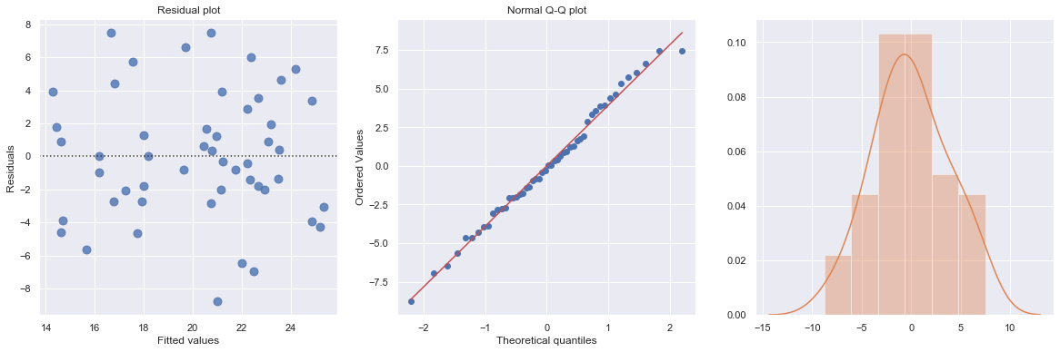
value='student_t',description='Distribution:',disabled=False));
The plot shows the Q-Q plot and histogram of four distributions including normal, student t, uniform and triangular.
Besides graphical method for assessing residual normality, there are several hypothesis tests in which the null hypothesis is that the errors have a normal distribution, such as
Kolmogorov-Smirnov Test
Anderson-Darling Test
Shapiro-Wilk Test
Ryan-Joiner Test
If those tests are available in software, then a large p-value indicates failure to reject this null hypothesis.
Fourth Assumption
The fourth assumption requires probabilistic independence of the errors. - This assumption means that information on some of the errors provides no information on the values of the other errors. However, when the sample data have been collected over time and the regression model fails to effectively capture any time trends, the random errors in the model are often positively correlated over time. This phenomenon is known as autocorrelation (or serial correlation) and can sometimes be detected by plotting the model residuals versus time. - For cross-sectional data, this assumption is usually taken for granted. - For time-series data, this assumption is often violated. - This is because of a property called autocorrelation. - The Durbin-Watson statistic is one measure of autocorrelation and thus measures the extent to which assumption 4 is violated.
Summary
We now summarize the four assumptions that underlie the linear regression model:
The mean of the response is a Linear function of the explanatory variables.
The errors are Independent.
The errors are Normally distributed.
The errors have Equal variances.
The first letters that are highlighted spell “LINE”.
Regression Estimation
We consider a simple example to illustrate how to use python package statsmodels to perform regression analysis and predictions.
Case: Manufacture Costs
A manufacturer wants to get a better understanding of its costs. We consider two variables: machine hours and production runs. A production run can produce a large batch of products. Once a production run is completed, the factory must set up for the next production run. Therefore, the costs include fixed costs associated with each production run and variable costs based on machine hours.
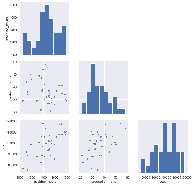
Scatterplot (with regression line and mean CI) and time series plot are presented:
[5]:
df = pd.read_csv(dataurl+'costs.csv', header=0, index_col='month')
def draw_scatterplot(x, y):
    fig, axes = plt.subplots(1, 2, figsize = (12,6))
    sns.regplot(x=df[x], y=df[y], data=df, ax=axes[0])
    axes[0].set_title('Scatterplot: X={} Y={}'.format(x,y))
    df[y].plot(ax=axes[1], xlim=(0,40))
    axes[1].set_title('Time series plot: {}'.format(y))
    plt.show()

interact(draw_scatterplot,
         x=widgets.Dropdown(options=df.columns,value=df.columns[0],
                            description='X:',disabled=False),
         y=widgets.Dropdown(options=df.columns,value=df.columns[2],
                            description='Y:',disabled=False));

g=sns.pairplot(df, height=3);
for i, j in zip(*np.triu_indices_from(g.axes, 1)):
    g.axes[i, j].set_visible(False)

toggle()
[5]:
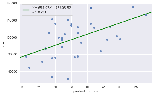
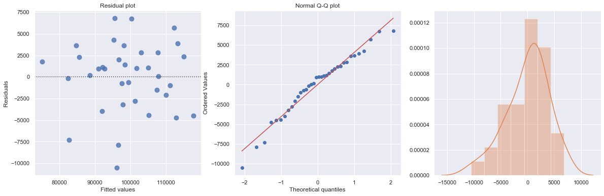
We regress costs against production runs with formula:
which is a simple regression because of only one explanatory variable.
[6]:
df = pd.read_csv(dataurl+'costs.csv', header=0, index_col='month')
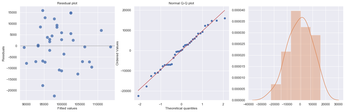
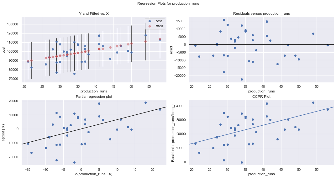
result = analysis(df, 'cost', ['production_runs'], printlvl=5)
fig = plt.figure(figsize=(15,8))
fig = sm.graphics.plot_regress_exog(result, "production_runs", fig=fig);
| Dep. Variable: | cost | R-squared: | 0.271 |
|---|---|---|---|
| Model: | OLS | Adj. R-squared: | 0.250 |
| Method: | Least Squares | F-statistic: | 12.64 |
| Date: | Wed, 14 Aug 2019 | Prob (F-statistic): | 0.00114 |
| Time: | 08:54:41 | Log-Likelihood: | -379.62 |
| No. Observations: | 36 | AIC: | 763.2 |
| Df Residuals: | 34 | BIC: | 766.4 |
| Df Model: | 1 | ||
| Covariance Type: | nonrobust |
| coef | std err | t | P>|t| | [0.025 | 0.975] | |
|---|---|---|---|---|---|---|
| Intercept | 7.561e+04 | 6808.611 | 11.104 | 0.000 | 6.18e+04 | 8.94e+04 |
| production_runs | 655.0707 | 184.275 | 3.555 | 0.001 | 280.579 | 1029.562 |
| Omnibus: | 0.597 | Durbin-Watson: | 2.090 |
|---|---|---|---|
| Prob(Omnibus): | 0.742 | Jarque-Bera (JB): | 0.683 |
| Skew: | -0.264 | Prob(JB): | 0.711 |
| Kurtosis: | 2.580 | Cond. No. | 160. |
Warnings:
[1] Standard Errors assume that the covariance matrix of the errors is correctly specified.
standard error of estimate:9457.23946


ANOVA Table:
| sum_sq | df | F | PR(>F) | |
|---|---|---|---|---|
| production_runs | 1.130248e+09 | 1.0 | 12.637029 | 0.001135 |
| Residual | 3.040939e+09 | 34.0 | NaN | NaN |
KstestResult(statistic=0.5, pvalue=7.573316153566455e-09)
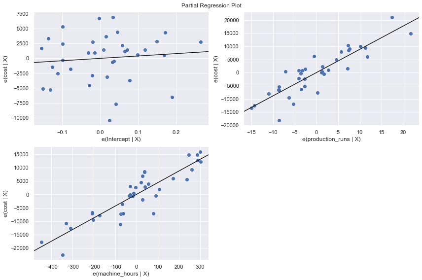
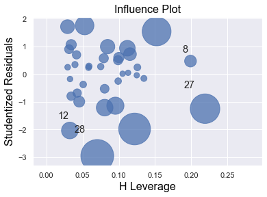
We perform a multiple regression on costs against both explanatory variables (production runs and machine hours) by using formula:
[7]:
df = pd.read_csv(dataurl+'costs.csv', header=0, index_col='month')
result = analysis(df, 'cost', ['production_runs','machine_hours'], printlvl=5)

fig = plt.figure(figsize=(12,8))
fig = sm.graphics.plot_partregress_grid(result, fig=fig);

fig = plt.figure(figsize=(10,8))
fig = sm.graphics.influence_plot(result,criterion="cook", fig=fig);
| Dep. Variable: | cost | R-squared: | 0.866 |
|---|---|---|---|
| Model: | OLS | Adj. R-squared: | 0.858 |
| Method: | Least Squares | F-statistic: | 107.0 |
| Date: | Wed, 14 Aug 2019 | Prob (F-statistic): | 3.75e-15 |
| Time: | 08:54:44 | Log-Likelihood: | -349.07 |
| No. Observations: | 36 | AIC: | 704.1 |
| Df Residuals: | 33 | BIC: | 708.9 |
| Df Model: | 2 | ||
| Covariance Type: | nonrobust |
| coef | std err | t | P>|t| | [0.025 | 0.975] | |
|---|---|---|---|---|---|---|
| Intercept | 3996.6782 | 6603.651 | 0.605 | 0.549 | -9438.551 | 1.74e+04 |
| production_runs | 883.6179 | 82.251 | 10.743 | 0.000 | 716.276 | 1050.960 |
| machine_hours | 43.5364 | 3.589 | 12.129 | 0.000 | 36.234 | 50.839 |
| Omnibus: | 3.142 | Durbin-Watson: | 1.313 |
|---|---|---|---|
| Prob(Omnibus): | 0.208 | Jarque-Bera (JB): | 2.259 |
| Skew: | -0.609 | Prob(JB): | 0.323 |
| Kurtosis: | 3.155 | Cond. No. | 1.42e+04 |
Warnings:
[1] Standard Errors assume that the covariance matrix of the errors is correctly specified.
[2] The condition number is large, 1.42e+04. This might indicate that there are
strong multicollinearity or other numerical problems.
standard error of estimate:4108.99309


ANOVA Table:
| sum_sq | df | F | PR(>F) | |
|---|---|---|---|---|
| production_runs | 1.948557e+09 | 1.0 | 115.409712 | 2.611395e-12 |
| machine_hours | 2.483773e+09 | 1.0 | 147.109602 | 1.046454e-13 |
| Residual | 5.571662e+08 | 33.0 | NaN | NaN |
KstestResult(statistic=0.5833333333333333, pvalue=3.6048681911998855e-12)
<Figure size 720x576 with 0 Axes>
Statistical Inferences
The regression output includes statistics for the regression model:
\(R^2\) (coefficient of determination) is an important measure of the goodness of fit of the least squares line. Formula for \(R^2\) is
where \(\overline{Y}\) is the mean of the observed data with \(\overline{Y} = 1/n \sum Y_i\) and \(\hat{Y}_i = a+b X\) is the fitted value.
It is the percentage of variation of the dependent variable explained by the regression.
It always ranges between 0 and 1. The better the linear fit is, the closer \(R^2\) is to 1.
\(R^2\) is the square of the multiple R, i.e., the correlation between the actual \(Y\) values and the fitted \(\hat{Y}\) values.
\(R^2\) can only increase when extra explanatory variables are added to an equation.
If \(R^2\) = 1, all of the data points fall perfectly on the regression line. The predictor \(X\) accounts for all of the variation in \(Y\).
If \(R^2\) = 0, the estimated regression line is perfectly horizontal. The predictor \(X\) accounts for none of the variation in \(Y\).
Adjusted \(R^2\) is an alternative measure that adjusts \(R^2\) for the number of explanatory variables in the equation. It is used primarily to monitor whether extra explanatory variables really belong in the equation.
Standard error of estimate (\(s_e\)), also known as the regression standard error or the residual standard error, provide a good indication of how useful the regression line is for predicting \(Y\) values from \(X\) values.
\(F\) statistics reports the result of \(F\)-test for the overall fit where the null hypothesis is that all coefficients of the explanatory variables are zero and the alternative is that at least one of these coefficients is not zero. It is possible, because of multicollinearity, to have all small \(t\)-values even though the variables as a whole have significant explanatory power.
Also, for each explanatory variable:
std err: reflects the level of accuracy of the coefficients. The lower it is, the higher is the level of accuracy
\(t\)-values for the individual regression coefficients, which is \(t\)-\(\text{value} = \text{coefficient}/\text{std err}\).
\(P >|t|\) is p-value. A p-value of less than 0.05 is considered to be statistically significant
When the p-value of a coefficient is greater or equal than 0.05, we don’t reject the null hypothesis \(H_0\): the coefficient is zero. The following two realities are possible:
We committed a Type II error. That is, in reality the coefficient is nonzero and our sample data just didn’t provide enough evidence.
There is not much of a linear relationship between explanatory and dependent variables, but they could have nonlinear relationship.
When the p-value of a coefficient is less than 0.05, we reject the null hypothesis \(H_0\): the coefficient is zero. The following two realities are possible:
We committed a Type II error. That is, in reality the coefficient is zero and we have a bad sample.
There is indeed a linear relationship, but a nonlinear function would fit the data even better.
Confidence Interval \([0.025, 0.975]\) represents the range in which our coefficients are likely to fall (with a likelihood of 95%)
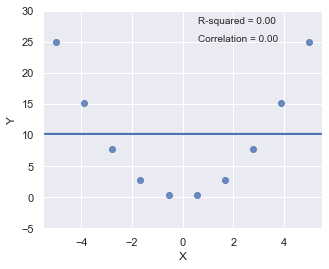
R-squared
Since \(R^2\) is the square of a correlation, it quantify the strength of a linear relationship. In other words, it is possible that \(R^2 = 0\%\) suggesting there is no linear relation between \(X\) and \(Y\), and yet a perfect curved (or “curvilinear” relationship) exists.
[8]:
x = np.linspace(-5, 5, 10)
y = x*x
df = pd.DataFrame({'X':x,'Y':y})
result = ols(formula="Y ~ X", data=df).fit()

fig, axes = plt.subplots(1,1,figsize=(5,4))
_ = sns.regplot(x=df.X, y=df.Y, data=df, ci=None, ax=axes)

plt.ylim(-5, 30)
axes.text(0.6, 28, 'R-squared = %0.2f' % result.rsquared)
axes.text(0.6, 25, 'Correlation = %0.2f' % np.sqrt(result.rsquared))
plt.show()
toggle()
[8]:
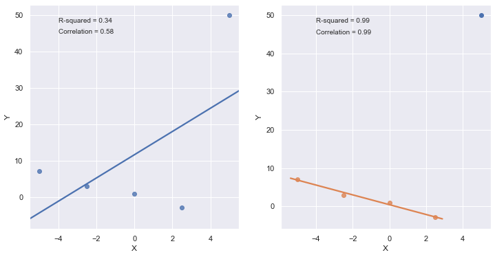
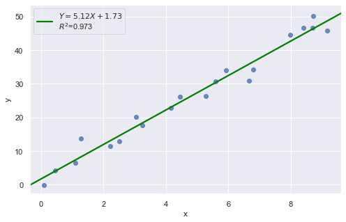
\(R^2\) can be greatly affected by just one data point (or a few data points).
[9]:
x = np.linspace(-5, 5, 5)
y = -1.5*x + 1*np.random.normal(size=5)
y[4] = 50
df = pd.DataFrame({'X':x,'Y':y})
res = ols(formula="Y ~ X", data=df).fit()

fig, axes = plt.subplots(1,2,figsize=(12,6))
_ = sns.regplot(x=df.X, y=df.Y, data=df, ci=None, ax=axes[0])
axes[0].text(-4, 48, 'R-squared = %0.2f' % res.rsquared)
axes[0].text(-4, 45, 'Correlation = %0.2f' % np.sqrt(res.rsquared))

xx = x[:4]
yy = y[:4]
df = pd.DataFrame({'X':xx,'Y':yy})
res = ols(formula="Y ~ X", data=df).fit()
_ = sns.regplot(x=df.X, y=df.Y, data=df, ci=None, ax=axes[1])
axes[1].text(-4, 48, 'R-squared = %0.2f' % res.rsquared)
axes[1].text(-4, 45, 'Correlation = %0.2f' % np.sqrt(res.rsquared))
axes[1].plot(x[4], y[4], 'bo')

plt.show()
toggle()
[9]:
A large \(R^2\) value should not be interpreted as meaning that the estimated regression line fits the data well. Another function might better describe the trend in the data.
[10]:
x = np.linspace(1, 5, 20)
y = np.power(x,3)
df = pd.DataFrame({'X':x,'Y':y})
res = ols(formula="Y ~ X", data=df).fit()

fig, axes = plt.subplots(1,1,figsize=(6,6))
_ = sns.regplot(x=df.X, y=df.Y, data=df, ci=None, ax=axes)
axes.text(1, 120, 'R-squared = %0.2f' % res.rsquared)
plt.title('Data generated by equation $Y = X^3$')
plt.show()
toggle()
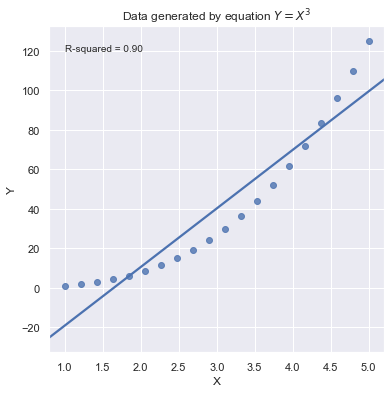
[10]:
Because statistical significance does not imply practical significance, large \(R^2\) value does not imply that the regression coefficient meaningfully different from 0. And a large \(R^2\) value does not necessarily mean the regression model can provide good predictions. It is still possible to get prediction intervals or confidence intervals that are too wide to be useful.
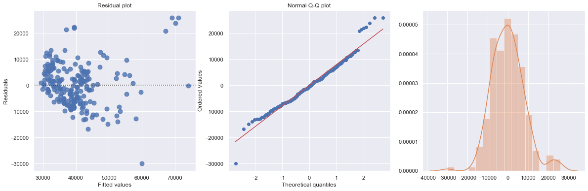
Residual Plot
Residual plot checks whether the regression model is appropriate for a dataset. It fits and removes a simple linear regression and then plots the residual values for each observation. Ideally, these values should be randomly scattered around \(y = 0\).
A “Good” Plot
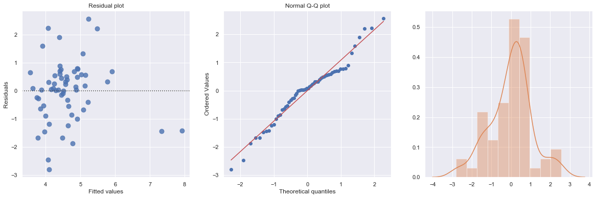
Example: The dataset includes measurements of the total lifetime consumption of alcohol on a random sample of n = 50 alcoholic men. We are interested in determining whether or not alcohol consumption was linearly related to muscle strength.
[11]:
df = pd.read_csv(dataurl+'alcoholarm.txt', delim_whitespace=True, header=0)
result = analysis(df, 'strength', ['alcohol'], printlvl=2)
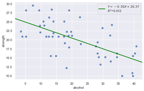
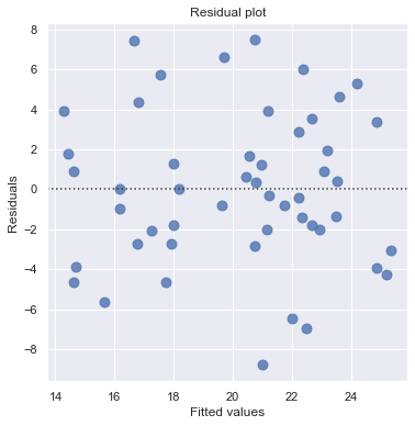
The scatter plot (on the left) suggests a decreasing linear relationship between alcohol and arm strength. It also suggests that there are no unusual data points in the data set.
This residual (residuals vs. fits) plot is a good example of suggesting about the appropriateness of the simple linear regression model
The residuals “bounce randomly” around the 0 line. This suggests that the assumption that the relationship is linear is reasonable.
The residuals roughly form a “horizontal band” around the 0 line. This suggests that the variances of the error terms are equal.
No one residual “stands out” from the basic random pattern of residuals. This suggests that there are no outliers.
In general, you expect your residual vs. fits plots to look something like the above plot. Interpreting these plots is subjective and many first time users tend to over-interpret these plots by looking at every twist and turn as something potentially troublesome. We should not put too much weight on residual plots based on small data sets because the size would be too small to make interpretation of a residuals plot worthwhile.
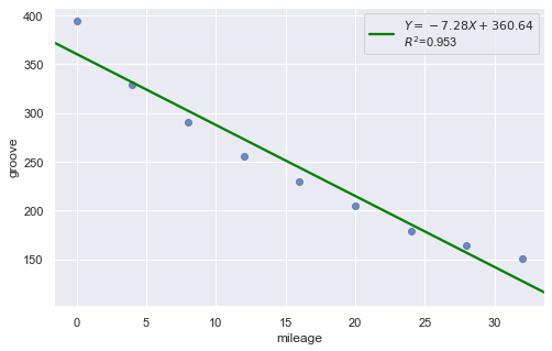
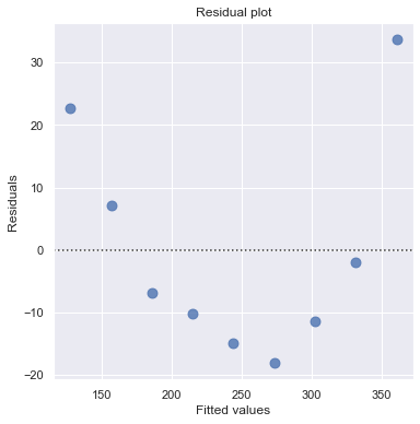
Nonlinear Relationship
Example: Is tire tread wear linearly related to mileage? As a result of the experiment, the researchers obtained a data set containing the mileage (in 1000 miles) driven and the depth of the remaining groove (in mils).
[12]:
df = pd.read_csv(dataurl+'treadwear.txt', sep='\s+', header=0)
result = analysis(df, 'groove', ['mileage'], printlvl=2)
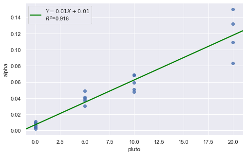
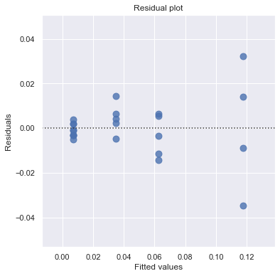
Non-constant Error Variance
Example: How is plutonium activity related to alpha particle counts? Plutonium emits subatomic particles — called alpha particles. Devices used to detect plutonium record the intensity of alpha particle strikes in counts per second. The dataset contains 23 samples of plutonium
[13]:
df = pd.read_csv(dataurl+'alphapluto.txt', sep='\s+', header=0)
result = analysis(df, 'alpha', ['pluto'], printlvl=2)
[14]:
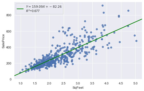
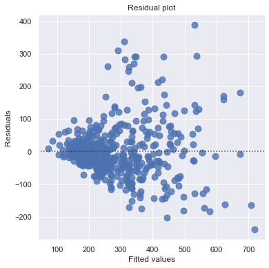
df = pd.read_csv(dataurl+'realestate.txt', sep='\s+', header=0)
result = analysis(df, 'SalePrice', ['SqFeet'], printlvl=2)
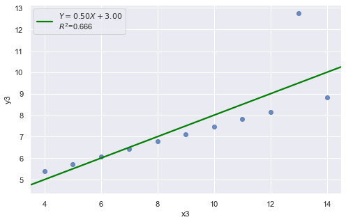
Outliers
[15]:
df = pd.read_csv(dataurl+'anscombe.txt', sep='\s+', header=0)
result = analysis(df, 'y3', ['x3'], printlvl=2)
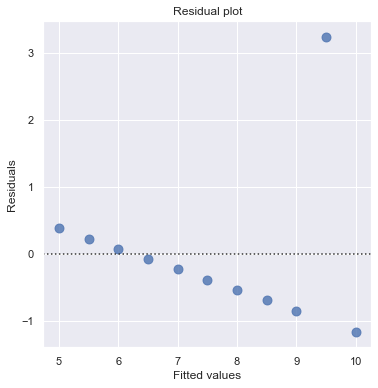
An alternative to the residuals vs. fits plot is a residuals vs. predictor plot. It is a scatter plot of residuals on the y axis and the predictor values on the \(x\)-axis. The interpretation of a residuals vs. predictor plot is identical to that for a residuals vs. fits plot.
Normal Q-Q Plot of Residuals
Normal Q-Q plot shows if residuals are normally distributed by checking if residuals follow a straight line well or deviate severely.
A “Good” Plot
[16]:
df = pd.read_csv(dataurl+'alcoholarm.txt', sep='\s+', header=0)
result = analysis(df, 'strength', ['alcohol'], printlvl=3)

KstestResult(statistic=0.3217352865304308, pvalue=4.179928356341629e-05)
More Examples
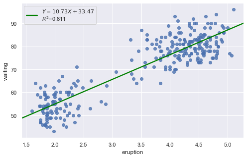
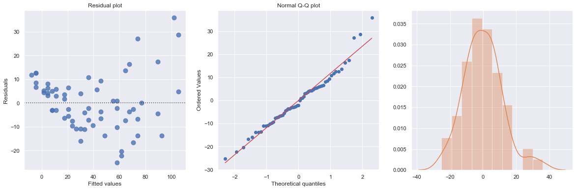
Example 1: A Q-Q plot of the residuals after a simple regression model is used for fitting ‘time to next eruption’ and ‘duration of last eruption for eruptions’ of Old Faithful geyser which was named for its frequent and somewhat predictable eruptions. Old Faithful is located in Yellowstone’s Upper Geyser Basin in the southwest section of the park.
[17]:
df = pd.read_csv(dataurl+'oldfaithful.txt', delim_whitespace=True, header=0)
result = analysis(df, 'waiting', ['eruption'], printlvl=3)
KstestResult(statistic=0.3748566542043297, pvalue=7.87278404247441e-35)
How to interpret?
[18]:
hide_answer()
[18]:
The histogram is roughly bell-shaped so it is an indication that it is reasonable to assume that the errors have a normal distribution.
The pattern of the normal probability plot is straight, so this plot also provides evidence that it is reasonable to assume that the errors have a normal distribution.
\(\blacksquare\)
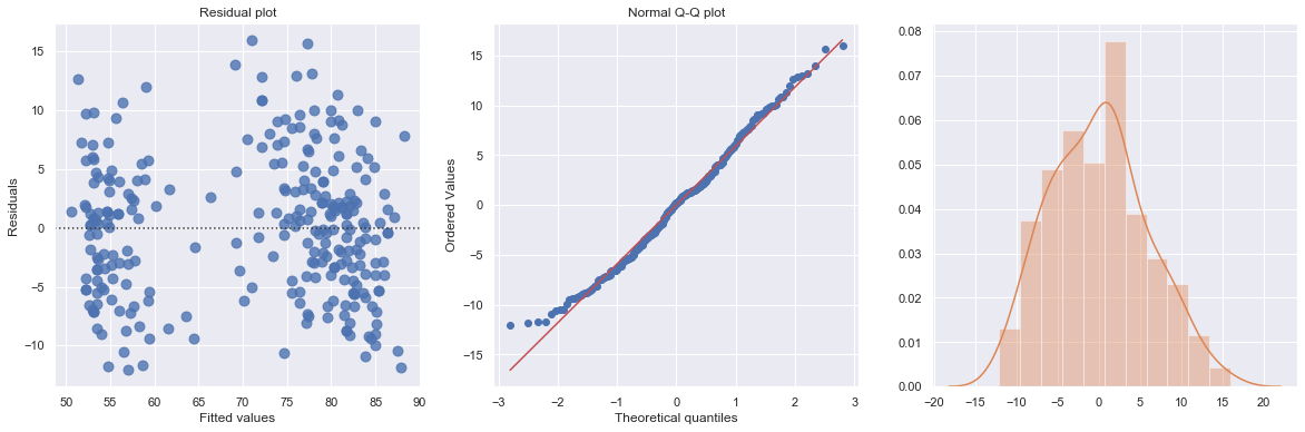
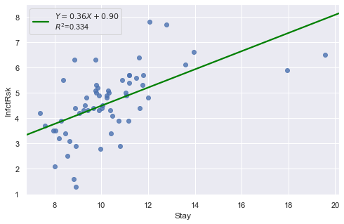
Example 2: The data contains ‘infection risk in a hospital’ and ‘average length of stay in the hospital’.
[19]:
df = pd.read_csv(dataurl+'infection12.txt', delim_whitespace=True, header=0)
result = analysis(df, 'InfctRsk', ['Stay'], printlvl=3)
KstestResult(statistic=0.11353657481026463, pvalue=0.39524100803555084)
How to interpret?
[20]:
hide_answer()
[20]:
The plot shows some deviation from the straight-line pattern indicating a distribution with heavier tails than a normal distribution. Also, the residual plot shows two possible outliers.
\(\blacksquare\)
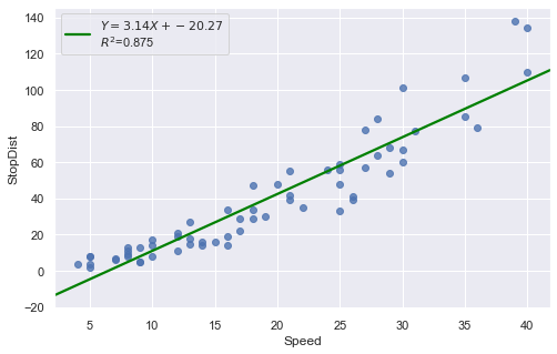
Example: A stopping distance data with stopping distance of a car and speed of the car when the brakes were applied.
[21]:
df = pd.read_csv(dataurl+'carstopping.txt', delim_whitespace=True, header=0)
result = analysis(df, 'StopDist', ['Speed'], printlvl=3)
KstestResult(statistic=0.49181308907235927, pvalue=1.3918967453080744e-14)
How to interpret?
[22]:
hide_answer()
[22]:
Fitting a simple linear regression model to these data leads to problems with both curvature and nonconstant variance. The nonlinearity is reasonable due to physical laws. One possible remedy is to transform variable(s).
\(\blacksquare\)
Advice to Managers
An old statistics joke
A physicist, an engineer, and a statistician are on a hunting trip. They are walking through the woods when they spot a deer in the clearing.
The physicist calculates the distance to the target, the velocity and drop of the bullet, adjusts, and fires, missing the deer by five feet to the left.
The engineer looks frustrated. “You forgot to account for the wind. Give it here.” After licking a finger to determine the wind speed and direction, the engineer snatches the rifle and fires, missing the deer by five feet to the right.
Suddenly, without firing a shot, the statistician cheers, “Woo hoo! We got it!”
[23]:
hide_answer()
[23]:
Being precisely perfect on average can mean being actually wrong each time. Regression can keep missing several feet to the left or several feet to the right. Even if it averages out to the correct answer, regression can mean never actually hitting the target.
Unlike regression, machine learning predictions might be wrong on average, but when the predictions miss, they often don’t miss by much. Statisticians describe this as allowing some bias in exchange for reducing variance.
\(\blacksquare\)
Correlation vs Causation
Correlation is not causation. Recall the sales prediction case. It’s easy to say that there is a correlation between rain and monthly sales as shown by the regression. However, unless you are selling umbrellas, it might be difficult to prove that there is cause and effect.
Petabytes allow us to say: “Correlation is enough.” and causality is dead - Chris Anderson. Given enough statistical evidence, it’s no longer necessary to understand why things happen – we need only know what things happen together.
What do you think?
[24]:
hide_answer()
[24]:
Correlation is not causation. When you see a correlation from a regression analysis, you cannot make assumptions. You have to go out and see what’s happening in the real world. What is the physical mechanism causing the relationship.
For example, go out and observe consumers buying your product in the rain, talk to them and find out what is actually causing them to make the purchase. The goal is NOT to figure out what is going on in the data but to figure out what is going on in the world.
Correlation is enough. The beer and diapers. Some time ago, Wal-Mart runs queries on its point of sale systems with 1.2 million baskets worth in all. Many correlations appeared. Some of these were obvious.

However, one correlation stood out like a sore thumb because it was so unexpected. Those queries revealed that, between 5pm and 7pm, customers tended to co-purchase beer and diapers. By moving these two items closer together, Wal-Mart reportedly saw the sales of both items increase geometrically.
The key question is “Can we take action on the basis of a correlation finding?” The answer depends primarily on two factors:
Confidence that the correlation will reliably recur in the future. The higher that confidence level, the more reasonable it is to take action in response.
The tradeoff between the risk and reward of acting. If the risk of acting and being wrong is extremely high, for example, acting on even a strong correlation may be a mistake.

\(\blacksquare\)
How do managers use it?
[25]:
hide_answer()
[25]:
Regression analysis is the go-to method in analytics. It helps us figure out what we can do. Mangers often uses it to
explain a phenomenon they want to understand (e.g. why did customer service calls drop last month?)
predict things about the future (e.g. what will sales look like over the next six months?)
decide what to do (e.g. should we go with this promotion or a different one?)
\(\blacksquare\)
What mistakes do managers make?
[26]:
hide_answer()
[26]:
Managers need to scope the problem. It’s managers’ job to identify the factors that may have an impact and ask your analyst to look at those. If you ask a data analyst to tell you something you don’t know, then you deserve what you get, which is bad analysis. It’s the same principle as flipping a coin. If someone do it enough times, you will eventually think you see something interesting, like a bunch of heads all in a row.
Regression analysis is very sensitive to bad data so be careful about data collecting and whether to act on the data.
Don’t make the mistake of ignoring the error term. If the regression explains 90% of the relationship, that is great. But if it explains 10%, and you act like it is 90%, that is not good.
Don’t let data replace your intuition and judgment.
\(\blacksquare\)
Regression Analysis
We consider a simple example to illustrate how to use python package statsmodels to perform regression analysis and predictions.
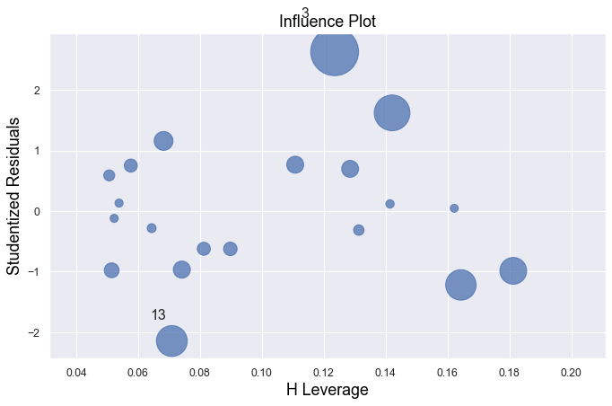
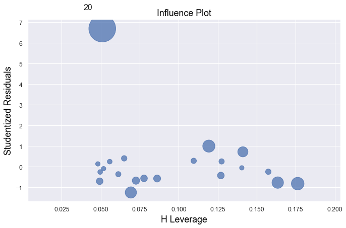
Influential Points
An influential point is an outlier that greatly affects the slope of the regression line. - An outlier is a data point whose response y does not follow the general trend of the rest of the data. - A data point has high leverage if it has “extreme” predictor x values. The lack of neighboring observations means that the fitted regression model will pass close to that particular observation.
Example 1:
[27]:
df = pd.read_csv(dataurl+'influence1.txt', delim_whitespace=True, header=0)
result = analysis(df, 'y', ['x'], printlvl=1)

fig, ax = plt.subplots(figsize=(10,6), dpi=80)
fig = sm.graphics.influence_plot(result, alpha  = 0.05, ax = ax, criterion="cooks")
Example 2:
[28]:
df = pd.read_csv(dataurl+'influence2.txt', delim_whitespace=True, header=0)
result = analysis(df, 'y', ['x'], printlvl=1)

fig, ax = plt.subplots(figsize=(10,6), dpi=80)
fig = sm.graphics.influence_plot(result, alpha  = 0.05, ax = ax, criterion="cooks")
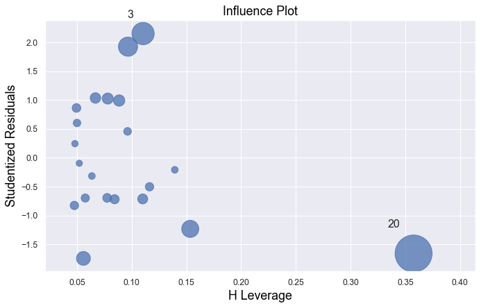
Example 3:
[29]:
df = pd.read_csv(dataurl+'influence3.txt', delim_whitespace=True, header=0)
result = analysis(df, 'y', ['x'], printlvl=1)

fig, ax = plt.subplots(figsize=(10,6), dpi=80)
fig = sm.graphics.influence_plot(result, alpha  = 0.05, ax = ax, criterion="cooks")
Example 4:
[30]:
df = pd.read_csv(dataurl+'influence4.txt', delim_whitespace=True, header=0)
result = analysis(df, 'y', ['x'], printlvl=1)

fig, ax = plt.subplots(figsize=(10,6), dpi=80)
fig = sm.graphics.influence_plot(result, alpha  = 0.05, ax = ax, criterion="cooks")
In all examples above, do they contain outliers or high leverage data points? Are identified data points influential?
[31]:
hide_answer()
[31]:
If an observation has a studentized residual that is larger than 3 (in absolute value) we can call it an outlier.
Example 1:
All of the data points follow the general trend of the rest of the data, so there are no outliers (in the \(Y\) direction). And, none of the data points are extreme with respect to \(X\), so there are no high leverage points. Overall, none of the data points would appear to be influential with respect to the location of the best fitting line.
Example 2:
There is one outlier, but no high leverage points. An easy way to determine if the data point is influential is to find the best fitting line twice — once with the red data point included and once with the red data point excluded. The data point is not influential.
Example 3:
The data point is not influential, nor is it an outlier, but it does have high leverage.
Example 4:
The data point is deemed both high leverage and an outlier, and it turned out to be influential too.
\(\blacksquare\)
Partial Regression Plots
For a particular independent variable \(X_i\), a partial regression plot shows:
residuals from regressing \(Y\) (the response variable) against all the independent variables except \(X_i\)
residuals from regressing \(X_i\) against the remaining independent variables.
It has a slope that is the same as the multiple regression coefficient for that predictor and also has the same residuals as the full multiple regression. So we can spot any outliers or influential points and tell whether they’ve affected the estimation of this particular coefficient. For the same reasons that we always look at a scatterplot before interpreting a simple regression coefficient, it’s a good idea to make a partial regression plot for any multiple regression coefficient that we hope to understand or interpret.
ANOVA
Consider the heart attacks in rabbits study with variables:
the infarcted area (in grams) of a rabbit
the region at risk (in grams) of a rabbit
\(X2\) =1 if early cooling of a rabbit, 0 if not
\(X3\) =1 if late cooling of a rabbit, 0 if not
The regress formula is
\begin{equation*} \text{Infarc} = \beta_0 + \beta_1 \times \text{Area} + \beta_2 \times \text{X2} + \beta_3 \times \text{X3} \end{equation*}
[32]:
df = pd.read_csv(dataurl+'coolhearts.txt', delim_whitespace=True, header=0)
result = analysis(df, 'Infarc', ['Area','X2','X3'], printlvl=0)
sm.stats.anova_lm(result, typ=2)
[32]:
| sum_sq | df | F | PR(>F) | |
|---|---|---|---|---|
| Area | 0.637420 | 1.0 | 32.753601 | 0.000004 |
| X2 | 0.297327 | 1.0 | 15.278050 | 0.000536 |
| X3 | 0.019814 | 1.0 | 1.018138 | 0.321602 |
| Residual | 0.544910 | 28.0 | NaN | NaN |
sum_sq[Residual]is sum of squared residuals;sum_sq[Area]issum_sq[Residual]-sum_sq[Residual]for regressionInfarc ~ X2 + X3, i.e., regression withoutArea;df[Residual]is degree of freedom \(=\) total number of observations (result.nobs) \(-\) the number of explanatory variables (3orresult.df_model) \(- 1 =\)result.df_resid;
ANOVA (analysis of variance) table for regression can be used to test hypothesis:
\begin{align} H_0:& \text{ a subset of explanatory variables have $0$ slope} \nonumber\\ H_a:& \text{ at least one variable in the subset of explanatory variables have nonzero slope} \nonumber \end{align}
Example 1: \begin{align} H_0:& \quad \beta_i = 0 ~ \forall i \in \{1\} \nonumber\\ H_a:& \quad \beta_i \neq 0 \text{ for at least one } i \in \{1\}. \nonumber \end{align}
[33]:
df = pd.read_csv(dataurl+'coolhearts.txt', delim_whitespace=True, header=0)
_ = GL_Ftest(df, 'Infarc', ['Area','X2','X3'], ['X2','X3'], 0.05)
The F-value is 32.754 and p-value is 0.000. Reject null hypothesis.
At least one variable in {'Area'} has nonzero slope.
It shows the size of the infarct is significantly related to the size of the area at risk. The result of such F-test is always equivalent to the t-test result.
Example 2: \begin{align} H_0:& \quad \beta_i = 0 ~ \forall i \in \{1,2,3\} \nonumber\\ H_a:& \quad \beta_i \neq 0 \text{ for at least one } i \in \{1,2,3\}. \nonumber \end{align}
[34]:
df = pd.read_csv(dataurl+'coolhearts.txt', delim_whitespace=True, header=0)
_ = GL_Ftest(df, 'Infarc', ['Area','X2','X3'], [], 0.05)
The F-value is 16.431 and p-value is 0.000. Reject null hypothesis.
At least one variable in {'Area', 'X3', 'X2'} has nonzero slope.
This is also called a test for the overall fit. The F-statistics and its p value are also available from the fvalue and f_pvalue properties of the regression result in statsmodels.
Example 3: \begin{align} H_0:& \quad \beta_i = 0 ~ \forall i \in \{2,3\} \nonumber\\ H_a:& \quad \beta_i \neq 0 \text{ for at least one } i \in \{2,3\}. \nonumber \end{align}
[35]:
df = pd.read_csv(dataurl+'coolhearts.txt', delim_whitespace=True, header=0)
_ = GL_Ftest(df, 'Infarc', ['Area','X2','X3'], ['Area'], 0.05)
The F-value is 8.590 and p-value is 0.001. Reject null hypothesis.
At least one variable in {'X3', 'X2'} has nonzero slope.
Let \(K \subseteq N\), we have two hypothesis \begin{align} H_0:& \quad \beta_i = 0 ~ \forall i \in K \nonumber\\ H_a:& \quad \beta_i \neq 0 \text{ for at least one } i \in K. \nonumber \end{align}
We consider two models \begin{align} \text{full model:} & \quad Y = \beta_0 + \sum_{i \in N} \beta_i X_i \nonumber\\ \text{reduced model:} & \quad Y = \beta_0 + \sum_{i \in K} \beta_i X_i. \nonumber\\ \end{align}
Let \(SSE(F)\) and \(SSE(R)\) be the sum of squared errors for the full and reduced models respectively where
\begin{equation*} SSE = \text{sum of squared residuals} = \sum e^2_i = \sum (Y_i - \hat{Y}_i)^2. \end{equation*}
The general linear statistic:
\begin{equation*} F^\ast = \frac{SSE(R) - SSE(F)}{df_R - df_F} \div \frac{SSE(F)}{df_F} \end{equation*}
and \(p\)-value is \begin{equation*} 1 - \text{F-dist}(F^\ast, df_R - df_F, df_F). \end{equation*}
Why don’t we perform a series of individual t-tests? For example, for the rabbit heart attacks study, we could have done the following in Example 3:
Fit the model InfSize ~ Area \(+\) x2 \(+\) x3 and use an individual t-test for x3.
If the test results indicate that we can drop x3 then fit the model oInfSize ~ Area \(+\) x2 and use an individual t-test for x2.
[36]:
hide_answer()
[36]:
Note that we’re using two individual t-tests instead of one F-test in the suggested method. It means the chance of drawing an incorrect conclusion in our testing procedure is higher. Recall that every time we do a hypothesis test, we can draw an incorrect conclusion by:
rejecting a true null hypothesis, i.e., make a type 1 error by concluding the tested predictor(s) should be retained in the model, when in truth it/they should be dropped; or
failing to reject a false null hypothesis, i.e., make a type 2 error by concluding the tested predictor(s) should be dropped from the model, when in truth it/they should be retained.
Thus, in general, the fewer tests we perform the better. In this case, this means that wherever possible using one F-test in place of multiple individual t-tests is preferable.
\(\blacksquare\)
Prediction
After we have estimated a regression equation from a dataset, we can use this equation to predict the value of the dependent variable for new observations.
[37]:
df = pd.read_csv(dataurl+'costs.csv', header=0, index_col='month')
result = analysis(df, 'cost', ['production_runs','machine_hours'], printlvl=0)

df_pred = pd.DataFrame({'machine_hours':[1430, 1560, 1520],'production_runs': [35,45,40]})
predict = result.get_prediction(df_pred)
predict.summary_frame(alpha=0.05)
[37]:
| mean | mean_se | mean_ci_lower | mean_ci_upper | obs_ci_lower | obs_ci_upper | |
|---|---|---|---|---|---|---|
| 0 | 97180.354898 | 697.961311 | 95760.341932 | 98600.367863 | 88700.800172 | 105659.909623 |
| 1 | 111676.265905 | 1135.822591 | 109365.417468 | 113987.114342 | 103002.948661 | 120349.583149 |
| 2 | 105516.720354 | 817.257185 | 103853.998110 | 107179.442598 | 96993.161428 | 114040.279281 |
mean is the value calculated based on the (sample) regression line
mean (or confidence) lower and upper limits offer the confidence interval of the average of predictor with given values of explanatory variables. In other words, if we run experiments many times with given values of explanatory variables, we have 95% confidence that the mean of the dependent variable will be in this interval.
obs (or prediction) lower and upper limits offer the confidence interval of a single prediction. In other words, if we run one experiment with given values of explanatory variables, we have 95% confidence that the value of the dependent variable will be in this interval.
Cross Validation
The fit from a regression analysis is often overly optimistic (over-fitted). There is no guarantee that the fit will be as good when th estimated regression equation is applied to new data.
To validate the fit, we can gather new data, predict the dependent variable and compare with known values of the dependent variable. However, most of the time we cannot obtain new independent data to validate our model. An alternative is to partition the sample data into a training set and testing (validation) set.
The simplest approach to cross-validation is to partition the sample observations randomly with 50% of the sample in each set or 60%/40% or 70%/30%.
[38]:
df = pd.read_csv(dataurl+'costs.csv', header=0, index_col='month')
result = analysis(df, 'cost', ['production_runs','machine_hours'], printlvl=0)

df_validate = pd.read_csv(dataurl+'validation.csv', header=0)
predict = result.get_prediction(df_validate)
df_validate['predict'] = predict.predicted_mean
r2 = np.corrcoef(df_validate.cost,df_validate.predict)[0,1]**2
stderr = np.sqrt(((df_validate.cost - df_validate.predict)**2).sum()/df_validate.shape[0]-3)
print('Validation R-squared:\t\t{:.3f}'.format(r2))
print('Validation StErr of Est:\t{:.3f}'.format(stderr))
Validation R-squared:           0.773
Validation StErr of Est:        5032.718
\(K\)-fold cross-validation can also be used. This partitions the sample dataset into \(K\) subsets with equal size. For each subset, we use it as testing set and the remaining \(K-1\) subsets as training set. We then calculate the sum of squared prediction errors, and combine the \(K\) estimates of prediction error to produce a \(K\)-fold cross-validation estimate.
Multicollinearity
Multicollinearity exists when two or more of the predictors in a regression model are moderately or highly correlated with one another. The exact linear relationship is fairly simple to spot because regression packages will typically respond with an error message. A more common and serious problem is multicollinearity, where explanatory variables are highly, but not exactly, correlated.
There are two types of multicollinearity:
Structural multicollinearity is a mathematical artifact caused by creating new predictors from other predictors — such as, creating the predictor \(X^2\) from the predictor \(X\).
Data-based multicollinearity, on the other hand, is a result of a poorly designed experiment, reliance on purely observational data, or the inability to manipulate the system on which the data are collected.
Variance inflation factor (VIF) can be used to identify multicollinearity. The VIF for \(X\) is defined as 1/(1 - R-square for \(X\)), where R-square for \(X\) variable is the usual R-square value from a regression with that \(X\) as the dependent variable and the other \(X\)’s as the explanatory variables.
[39]:
from statsmodels.stats.outliers_influence import variance_inflation_factor
from patsy import dmatrices

df = pd.read_csv(dataurl+'multicollinearity.csv',header=0, index_col='person')
features = "+".join(df.drop(columns=['salary']).columns)
y, X = dmatrices('salary ~' + features, df, return_type='dataframe')
VIF = pd.DataFrame()
VIF["VIF Factor"] = [variance_inflation_factor(X.values, i) for i in range(1,X.shape[1])]
VIF["Features"] = X.drop(columns=['Intercept']).columns
display(VIF)

def calculate_vif_(X, thresh=5.0):
    cols = X.columns
    variables = np.arange(X.shape[1])
    dropped=True
    while dropped:
        dropped=False
        c = X[cols[variables]].values
        vif = [variance_inflation_factor(c, ix) for ix in np.arange(c.shape[1])]

        maxloc = vif.index(max(vif))
        if max(vif) > thresh:
            print('dropping \'' + X[cols[variables]].columns[maxloc] + '\' at index: ' + str(maxloc))
            variables = np.delete(variables, maxloc)
            dropped=True

    print('Remaining variables:')
    print(X.columns[variables])

calculate_vif_(X.drop(columns=['Intercept']))
toggle()
| VIF Factor | Features | |
|---|---|---|
| 0 | 1.001383 | gender[T.Male] |
| 1 | 31.503655 | age |
| 2 | 38.153090 | experience |
| 3 | 5.594549 | seniority |
dropping 'experience' at index: 2
dropping 'age' at index: 1
Remaining variables:
Index(['gender[T.Male]', 'seniority'], dtype='object')
[39]:
Regression Modeling
Categorical Variables
The only meaningful way to summarize categorical data is with counts of observations in the categories. We consider a bank’s employee data.
[40]:
df_salary = pd.read_csv(dataurl+'salaries.csv', header=0, index_col='employee')
interact(plot_hist,
         column=widgets.Dropdown(options=df_salary.columns[:-1],value=df_salary.columns[0],
                            description='Column:',disabled=False));
To analyze whether the bank discriminates against females in terms of salary, we consider regression model:
[41]:
df = pd.read_csv(dataurl+'salaries.csv', header=0, index_col='employee')
result = analysis(df, 'salary', ['years1', 'years2', 'C(gender, Treatment(\'Male\'))'], printlvl=5)
| Dep. Variable: | salary | R-squared: | 0.492 |
|---|---|---|---|
| Model: | OLS | Adj. R-squared: | 0.485 |
| Method: | Least Squares | F-statistic: | 65.93 |
| Date: | Wed, 14 Aug 2019 | Prob (F-statistic): | 7.61e-30 |
| Time: | 08:55:10 | Log-Likelihood: | -2164.5 |
| No. Observations: | 208 | AIC: | 4337. |
| Df Residuals: | 204 | BIC: | 4350. |
| Df Model: | 3 | ||
| Covariance Type: | nonrobust |
| coef | std err | t | P>|t| | [0.025 | 0.975] | |
|---|---|---|---|---|---|---|
| Intercept | 3.549e+04 | 1341.022 | 26.466 | 0.000 | 3.28e+04 | 3.81e+04 |
| C(gender, Treatment('Male'))[T.Female] | -8080.2121 | 1198.170 | -6.744 | 0.000 | -1.04e+04 | -5717.827 |
| years1 | 987.9937 | 80.928 | 12.208 | 0.000 | 828.431 | 1147.557 |
| years2 | 131.3379 | 180.923 | 0.726 | 0.469 | -225.381 | 488.057 |
| Omnibus: | 15.654 | Durbin-Watson: | 1.286 |
|---|---|---|---|
| Prob(Omnibus): | 0.000 | Jarque-Bera (JB): | 25.154 |
| Skew: | 0.434 | Prob(JB): | 3.45e-06 |
| Kurtosis: | 4.465 | Cond. No. | 34.6 |
Warnings:
[1] Standard Errors assume that the covariance matrix of the errors is correctly specified.
standard error of estimate:8079.39743


ANOVA Table:
| sum_sq | df | F | PR(>F) | |
|---|---|---|---|---|
| C(gender, Treatment('Male')) | 2.968701e+09 | 1.0 | 45.478753 | 1.556196e-10 |
| years1 | 9.728975e+09 | 1.0 | 149.042170 | 4.314965e-26 |
| years2 | 3.439940e+07 | 1.0 | 0.526979 | 4.687119e-01 |
| Residual | 1.331644e+10 | 204.0 | NaN | NaN |
KstestResult(statistic=0.5240384615384616, pvalue=1.0087139661949263e-53)
The regression is equivalent to fit data into two separate regression functions. However, it is usually easier and more efficient to answer research questions concerning the binary predictor variable by using one combined regression function.
[42]:
def update(column):
    df = pd.read_csv(dataurl+'salaries.csv', header=0, index_col='employee')
    sns.lmplot(x=column, y='salary', data=df, fit_reg=True, hue='gender', legend=True, height=6);

interact(update,
         column=widgets.Dropdown(options=['years1', 'years2', 'age', 'education'],value='years1',
                            description='Column:',disabled=False));
Interaction Variables
Interaction with Categorical Variable
Example: consider salary data with interaction gender*year1
[43]:
result = ols(formula="salary ~ years1 + C(gender, Treatment('Male'))*years1", data=df_salary).fit()
display(result.summary())
print("\nANOVA Table:\n")
display(sm.stats.anova_lm(result, typ=1))
| Dep. Variable: | salary | R-squared: | 0.639 |
|---|---|---|---|
| Model: | OLS | Adj. R-squared: | 0.633 |
| Method: | Least Squares | F-statistic: | 120.2 |
| Date: | Wed, 14 Aug 2019 | Prob (F-statistic): | 7.51e-45 |
| Time: | 08:55:12 | Log-Likelihood: | -2129.2 |
| No. Observations: | 208 | AIC: | 4266. |
| Df Residuals: | 204 | BIC: | 4280. |
| Df Model: | 3 | ||
| Covariance Type: | nonrobust |
| coef | std err | t | P>|t| | [0.025 | 0.975] | |
|---|---|---|---|---|---|---|
| Intercept | 3.043e+04 | 1216.574 | 25.013 | 0.000 | 2.8e+04 | 3.28e+04 |
| C(gender, Treatment('Male'))[T.Female] | 4098.2519 | 1665.842 | 2.460 | 0.015 | 813.776 | 7382.727 |
| years1 | 1527.7617 | 90.460 | 16.889 | 0.000 | 1349.405 | 1706.119 |
| C(gender, Treatment('Male'))[T.Female]:years1 | -1247.7984 | 136.676 | -9.130 | 0.000 | -1517.277 | -978.320 |
| Omnibus: | 11.523 | Durbin-Watson: | 1.188 |
|---|---|---|---|
| Prob(Omnibus): | 0.003 | Jarque-Bera (JB): | 15.614 |
| Skew: | 0.379 | Prob(JB): | 0.000407 |
| Kurtosis: | 4.108 | Cond. No. | 58.3 |
Warnings:
[1] Standard Errors assume that the covariance matrix of the errors is correctly specified.
ANOVA Table:
| df | sum_sq | mean_sq | F | PR(>F) | |
|---|---|---|---|---|---|
| C(gender, Treatment('Male')) | 1.0 | 3.149634e+09 | 3.149634e+09 | 67.789572 | 2.150454e-14 |
| years1 | 1.0 | 9.726635e+09 | 9.726635e+09 | 209.346370 | 4.078705e-33 |
| C(gender, Treatment('Male')):years1 | 1.0 | 3.872606e+09 | 3.872606e+09 | 83.350112 | 6.833545e-17 |
| Residual | 204.0 | 9.478232e+09 | 4.646192e+07 | NaN | NaN |
Example: Let’s consider some contrived data
[44]:
np.random.seed(123)
size = 20
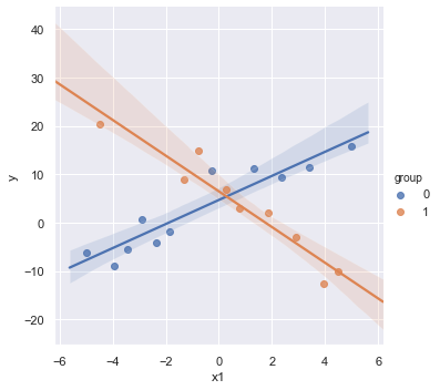
x1 = np.linspace(-5,5,size)
group = np.random.randint(0, 2, size=size)
y = 5 + (3-7*group)*x1 + 3*np.random.normal(size=size)
df = pd.DataFrame({'y':y, 'x1':x1, 'group':group})
sns.lmplot(x='x1', y='y', data=df, fit_reg=True, hue='group', legend=True);
result = analysis(df, 'y', ['x1', 'group'], printlvl=4)
| Dep. Variable: | y | R-squared: | 0.004 |
|---|---|---|---|
| Model: | OLS | Adj. R-squared: | -0.113 |
| Method: | Least Squares | F-statistic: | 0.03659 |
| Date: | Wed, 14 Aug 2019 | Prob (F-statistic): | 0.964 |
| Time: | 08:55:13 | Log-Likelihood: | -72.898 |
| No. Observations: | 20 | AIC: | 151.8 |
| Df Residuals: | 17 | BIC: | 154.8 |
| Df Model: | 2 | ||
| Covariance Type: | nonrobust |
| coef | std err | t | P>|t| | [0.025 | 0.975] | |
|---|---|---|---|---|---|---|
| Intercept | 3.1116 | 3.075 | 1.012 | 0.326 | -3.377 | 9.600 |
| x1 | 0.1969 | 0.765 | 0.257 | 0.800 | -1.417 | 1.811 |
| group | 0.0733 | 4.667 | 0.016 | 0.988 | -9.773 | 9.920 |
| Omnibus: | 0.957 | Durbin-Watson: | 2.131 |
|---|---|---|---|
| Prob(Omnibus): | 0.620 | Jarque-Bera (JB): | 0.741 |
| Skew: | 0.008 | Prob(JB): | 0.690 |
| Kurtosis: | 2.057 | Cond. No. | 7.06 |
Warnings:
[1] Standard Errors assume that the covariance matrix of the errors is correctly specified.
standard error of estimate:10.04661
KstestResult(statistic=0.44990149282919256, pvalue=0.0003257504098859564)
The scatterplot shows that both explanatory variables x and group are related to y. However, the regression results show that there is insufficient evidence to conclude that x and group are related to y. The example shows that if we leave an important interaction term out of our model, our analysis can lead us to make erroneous conclusions.
Without interaction variables, we assume the effect of each \(X\) on \(Y\) is independent of the value of the other \(X\)’s, which is not the case in this contrived data as shown in the scatterplot.
Now, consider a regression model contains an interaction term between the two predictors.
[45]:
result = analysis(df, 'y', ['x1', 'x1*C(group)'], printlvl=4)
| Dep. Variable: | y | R-squared: | 0.897 |
|---|---|---|---|
| Model: | OLS | Adj. R-squared: | 0.878 |
| Method: | Least Squares | F-statistic: | 46.57 |
| Date: | Wed, 14 Aug 2019 | Prob (F-statistic): | 3.95e-08 |
| Time: | 08:55:14 | Log-Likelihood: | -50.187 |
| No. Observations: | 20 | AIC: | 108.4 |
| Df Residuals: | 16 | BIC: | 112.4 |
| Df Model: | 3 | ||
| Covariance Type: | nonrobust |
| coef | std err | t | P>|t| | [0.025 | 0.975] | |
|---|---|---|---|---|---|---|
| Intercept | 4.7029 | 1.027 | 4.578 | 0.000 | 2.525 | 6.881 |
| C(group)[T.1] | 1.7810 | 1.552 | 1.147 | 0.268 | -1.509 | 5.071 |
| x1 | 2.4905 | 0.319 | 7.798 | 0.000 | 1.813 | 3.168 |
| x1:C(group)[T.1] | -6.1842 | 0.524 | -11.792 | 0.000 | -7.296 | -5.072 |
| Omnibus: | 1.739 | Durbin-Watson: | 1.433 |
|---|---|---|---|
| Prob(Omnibus): | 0.419 | Jarque-Bera (JB): | 1.403 |
| Skew: | 0.607 | Prob(JB): | 0.496 |
| Kurtosis: | 2.541 | Cond. No. | 7.68 |
Warnings:
[1] Standard Errors assume that the covariance matrix of the errors is correctly specified.
standard error of estimate:3.32671
KstestResult(statistic=0.40384330620002296, pvalue=0.0018511879743272586)
The non-significance for the coefficients of group indicates no observed difference between the mean values of x1 in different groups.
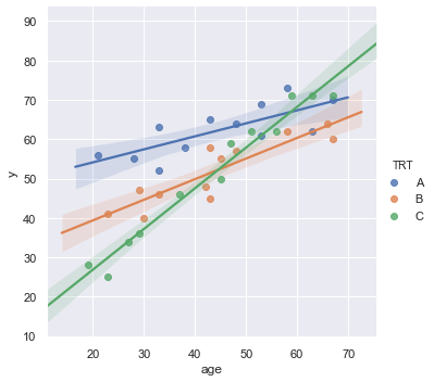
Example: Researchers are interested in comparing the effectiveness of three treatments (A,B,C) for severe depression. They collect the data on a random sample of \(n = 36\) severely depressed individuals including following variables:
measure of the effectiveness of the treatment for each individual
age (in years) of each individual i
x2 = 1 if an individual is received treatment A and 0, if not
x3 = 1 if an individual is received treatment B and 0, if not
The regression model:
\begin{align} \text{y} = \beta_0 + \beta_1 \times \text{age} + \beta_2 \times \text{x2} + \beta_3 \times \text{x3} + \beta_{12} \times \text{age} \times \text{x2} + \beta_{13} \times \text{age} \times \text{x3} \end{align}
[46]:
df = pd.read_csv(dataurl+'depression.txt', delim_whitespace=True, header=0)
sns.lmplot(x='age', y='y', data=df, fit_reg=True, hue='TRT', legend=True);
[47]:
result = analysis(df, 'y', ['age', 'age*x2', 'age*x3'], printlvl=4)
sm.stats.anova_lm(result, typ=1)
| Dep. Variable: | y | R-squared: | 0.914 |
|---|---|---|---|
| Model: | OLS | Adj. R-squared: | 0.900 |
| Method: | Least Squares | F-statistic: | 64.04 |
| Date: | Wed, 14 Aug 2019 | Prob (F-statistic): | 4.26e-15 |
| Time: | 08:55:16 | Log-Likelihood: | -97.024 |
| No. Observations: | 36 | AIC: | 206.0 |
| Df Residuals: | 30 | BIC: | 215.5 |
| Df Model: | 5 | ||
| Covariance Type: | nonrobust |
| coef | std err | t | P>|t| | [0.025 | 0.975] | |
|---|---|---|---|---|---|---|
| Intercept | 6.2114 | 3.350 | 1.854 | 0.074 | -0.630 | 13.052 |
| age | 1.0334 | 0.072 | 14.288 | 0.000 | 0.886 | 1.181 |
| x2 | 41.3042 | 5.085 | 8.124 | 0.000 | 30.920 | 51.688 |
| age:x2 | -0.7029 | 0.109 | -6.451 | 0.000 | -0.925 | -0.480 |
| x3 | 22.7068 | 5.091 | 4.460 | 0.000 | 12.310 | 33.104 |
| age:x3 | -0.5097 | 0.110 | -4.617 | 0.000 | -0.735 | -0.284 |
| Omnibus: | 2.593 | Durbin-Watson: | 1.633 |
|---|---|---|---|
| Prob(Omnibus): | 0.273 | Jarque-Bera (JB): | 1.475 |
| Skew: | -0.183 | Prob(JB): | 0.478 |
| Kurtosis: | 2.079 | Cond. No. | 529. |
Warnings:
[1] Standard Errors assume that the covariance matrix of the errors is correctly specified.
standard error of estimate:3.92491
KstestResult(statistic=0.3553429742849312, pvalue=0.00014233708080337406)
[47]:
| df | sum_sq | mean_sq | F | PR(>F) | |
|---|---|---|---|---|---|
| age | 1.0 | 3424.431786 | 3424.431786 | 222.294615 | 2.058902e-15 |
| x2 | 1.0 | 803.804498 | 803.804498 | 52.178412 | 4.856763e-08 |
| age:x2 | 1.0 | 375.254832 | 375.254832 | 24.359407 | 2.794727e-05 |
| x3 | 1.0 | 0.936671 | 0.936671 | 0.060803 | 8.069102e-01 |
| age:x3 | 1.0 | 328.424475 | 328.424475 | 21.319447 | 6.849515e-05 |
| Residual | 30.0 | 462.147738 | 15.404925 | NaN | NaN |
For each age, is there a difference in the mean effectiveness for the three treatments?
[48]:
hide_answer()
[48]:
\begin{align*} \text{Treatment A:} & \quad \mu_Y = (\beta_0 + \beta_2) + (\beta_1 + \beta_{12}) \times \text{age} \\ \text{Treatment B:} & \quad \mu_Y = (\beta_0 + \beta_3) + (\beta_1 + \beta_{13}) \times \text{age} \\ \text{Treatment C:} & \quad \mu_Y = \beta_0 + \beta_1 \times \text{age} \end{align*}
The research question is equivalent to ask \begin{align*} \text{Treatment A} - \text{Treatment C} &= 0 = \beta_2 + \beta_{12} \times \text{age} \\ \text{Treatment B} - \text{Treatment C} &= 0 = \beta_3 + \beta_{13} \times \text{age} \end{align*}
Thus, we test hypothesis \begin{align} H_0:& \quad \beta_2 = \beta_3 = \beta_{12} = \beta_{13} = 0 \nonumber\\ H_a:& \quad \text{at least one is nonzero} \nonumber \end{align}
The python code is:
_ =GL_Ftest(df, 'y', ['age', 'x2', 'x3', 'age:x2', 'age:x3'], ['age'], 0.05, typ=1)
\(\blacksquare\)
Does the effect of age on the treatment’s effectiveness depend on treatment?
[49]:
hide_answer()
[49]:
The question asks if the two interaction parameters \(\beta_{12}\) and \(\beta_{13}\) are significant.
The python code is:
_ =GL_Ftest(df, 'y', ['age', 'x2', 'x3', 'age:x2', 'age:x3'], ['age', 'x2', 'x3'], 0.05, typ=1)
\(\blacksquare\)
Interactions Between Continuous Variables
Typically, regression models that include interactions between quantitative predictors adhere to the hierarchy principle, which says that if your model includes an interaction term, \(X_1 X_2\), and \(X_1 X_2\) is shown to be a statistically significant predictor of Y, then your model should also include the “main effects,” \(X_1\) and \(X_2\), whether or not the coefficients for these main effects are significant. Depending on the subject area, there may be circumstances where a main effect could be excluded, but this tends to be the exception.
Transformations
Log-transform
Transformation is used widely in regression analysis because they have a meaningful interpretation.
\(Y = a \log(X) + \cdots\): 1% increase by X, Y is expected to increase by 0.01*a amount
\(\log(Y) = a X + \cdots\): 1unit increase by X, Y is expected to increase by (100*a)%
\(\log(Y) = a \log(X) + \cdots\): 1% increase by X, Y is expected to increase by a%
Transforming the \(X\) values is appropriate when non-linearity is the only problem (i.e., the independence, normality, and equal variance conditions are met)
Transforming the \(Y\) values should be considered when non-normality and/or unequal variances are the problems with the model.
[50]:
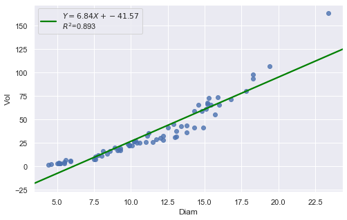
df = pd.read_csv(dataurl+'shortleaf.txt', delim_whitespace=True, header=0)
result = analysis(df, 'Vol', ['Diam'], printlvl=4)
| Dep. Variable: | Vol | R-squared: | 0.893 |
|---|---|---|---|
| Model: | OLS | Adj. R-squared: | 0.891 |
| Method: | Least Squares | F-statistic: | 564.9 |
| Date: | Wed, 14 Aug 2019 | Prob (F-statistic): | 1.17e-34 |
| Time: | 08:55:18 | Log-Likelihood: | -258.61 |
| No. Observations: | 70 | AIC: | 521.2 |
| Df Residuals: | 68 | BIC: | 525.7 |
| Df Model: | 1 | ||
| Covariance Type: | nonrobust |
| coef | std err | t | P>|t| | [0.025 | 0.975] | |
|---|---|---|---|---|---|---|
| Intercept | -41.5681 | 3.427 | -12.130 | 0.000 | -48.406 | -34.730 |
| Diam | 6.8367 | 0.288 | 23.767 | 0.000 | 6.263 | 7.411 |
| Omnibus: | 29.509 | Durbin-Watson: | 0.562 |
|---|---|---|---|
| Prob(Omnibus): | 0.000 | Jarque-Bera (JB): | 85.141 |
| Skew: | 1.240 | Prob(JB): | 3.25e-19 |
| Kurtosis: | 7.800 | Cond. No. | 34.8 |
Warnings:
[1] Standard Errors assume that the covariance matrix of the errors is correctly specified.
standard error of estimate:9.87485
KstestResult(statistic=0.4372892531717568, pvalue=1.0701622883725878e-12)
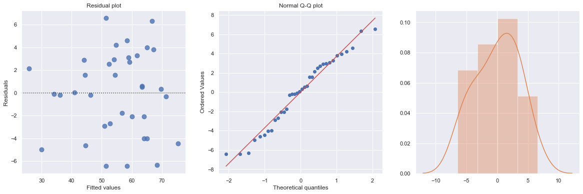
The Q-Q plot suggests that the error terms are not normal. We can log-transform \(X\) (Diam).
[51]:
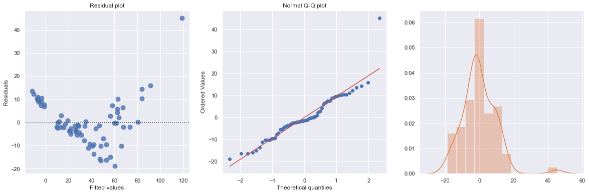
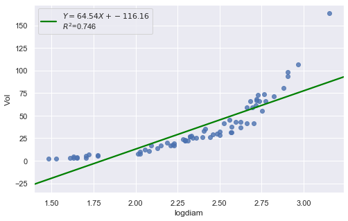
df = pd.read_csv(dataurl+'shortleaf.txt', delim_whitespace=True, header=0)
df['logvol'] = np.log(df.Vol)
df['logdiam'] = np.log(df.Diam)
result = analysis(df, 'Vol', ['logdiam'], printlvl=4)
| Dep. Variable: | Vol | R-squared: | 0.746 |
|---|---|---|---|
| Model: | OLS | Adj. R-squared: | 0.743 |
| Method: | Least Squares | F-statistic: | 200.2 |
| Date: | Wed, 14 Aug 2019 | Prob (F-statistic): | 6.10e-22 |
| Time: | 08:55:20 | Log-Likelihood: | -288.66 |
| No. Observations: | 70 | AIC: | 581.3 |
| Df Residuals: | 68 | BIC: | 585.8 |
| Df Model: | 1 | ||
| Covariance Type: | nonrobust |
| coef | std err | t | P>|t| | [0.025 | 0.975] | |
|---|---|---|---|---|---|---|
| Intercept | -116.1618 | 10.830 | -10.726 | 0.000 | -137.773 | -94.551 |
| logdiam | 64.5358 | 4.562 | 14.148 | 0.000 | 55.433 | 73.638 |
| Omnibus: | 50.047 | Durbin-Watson: | 0.324 |
|---|---|---|---|
| Prob(Omnibus): | 0.000 | Jarque-Bera (JB): | 219.500 |
| Skew: | 2.099 | Prob(JB): | 2.17e-48 |
| Kurtosis: | 10.591 | Cond. No. | 16.6 |
Warnings:
[1] Standard Errors assume that the covariance matrix of the errors is correctly specified.
standard error of estimate:15.17022
KstestResult(statistic=0.5855934039207538, pvalue=2.338971194588551e-23)
Transforming only the x values doesn’t change the non-linearity at all and improve the normality of the error terms either. We perform log-transform on both \(X\) and \(Y\).
[52]:
result = analysis(df, 'logvol', ['logdiam'], printlvl=4)
| Dep. Variable: | logvol | R-squared: | 0.974 |
|---|---|---|---|
| Model: | OLS | Adj. R-squared: | 0.973 |
| Method: | Least Squares | F-statistic: | 2509. |
| Date: | Wed, 14 Aug 2019 | Prob (F-statistic): | 2.08e-55 |
| Time: | 08:55:21 | Log-Likelihood: | 25.618 |
| No. Observations: | 70 | AIC: | -47.24 |
| Df Residuals: | 68 | BIC: | -42.74 |
| Df Model: | 1 | ||
| Covariance Type: | nonrobust |
| coef | std err | t | P>|t| | [0.025 | 0.975] | |
|---|---|---|---|---|---|---|
| Intercept | -2.8718 | 0.122 | -23.626 | 0.000 | -3.114 | -2.629 |
| logdiam | 2.5644 | 0.051 | 50.090 | 0.000 | 2.462 | 2.667 |
| Omnibus: | 1.405 | Durbin-Watson: | 1.359 |
|---|---|---|---|
| Prob(Omnibus): | 0.495 | Jarque-Bera (JB): | 1.119 |
| Skew: | -0.051 | Prob(JB): | 0.572 |
| Kurtosis: | 2.389 | Cond. No. | 16.6 |
Warnings:
[1] Standard Errors assume that the covariance matrix of the errors is correctly specified.
standard error of estimate:0.17026
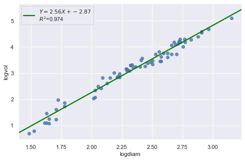
KstestResult(statistic=0.3711075900985334, pvalue=3.691529639884377e-09)
The residual and Q-Q plot has improved substantially
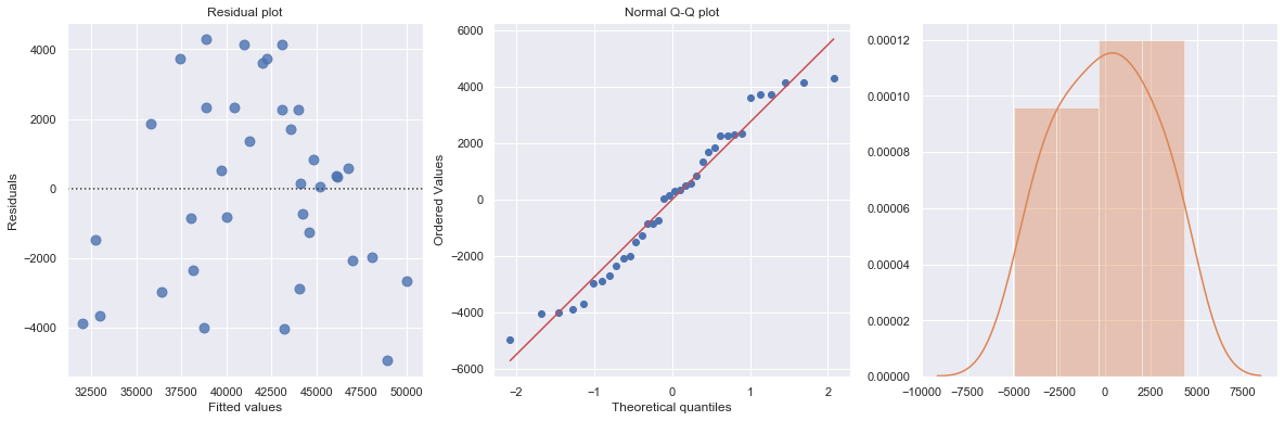
Polynomial Transformations
[53]:
df = pd.read_csv(dataurl+'costunits.csv', header=0, index_col='month')
result = analysis(df, 'cost', ['units'], printlvl=4)
| Dep. Variable: | cost | R-squared: | 0.736 |
|---|---|---|---|
| Model: | OLS | Adj. R-squared: | 0.728 |
| Method: | Least Squares | F-statistic: | 94.75 |
| Date: | Wed, 14 Aug 2019 | Prob (F-statistic): | 2.32e-11 |
| Time: | 08:55:23 | Log-Likelihood: | -334.94 |
| No. Observations: | 36 | AIC: | 673.9 |
| Df Residuals: | 34 | BIC: | 677.0 |
| Df Model: | 1 | ||
| Covariance Type: | nonrobust |
| coef | std err | t | P>|t| | [0.025 | 0.975] | |
|---|---|---|---|---|---|---|
| Intercept | 2.365e+04 | 1917.137 | 12.337 | 0.000 | 1.98e+04 | 2.75e+04 |
| units | 30.5331 | 3.137 | 9.734 | 0.000 | 24.158 | 36.908 |
| Omnibus: | 4.527 | Durbin-Watson: | 2.144 |
|---|---|---|---|
| Prob(Omnibus): | 0.104 | Jarque-Bera (JB): | 1.765 |
| Skew: | -0.042 | Prob(JB): | 0.414 |
| Kurtosis: | 1.918 | Cond. No. | 2.57e+03 |
Warnings:
[1] Standard Errors assume that the covariance matrix of the errors is correctly specified.
[2] The condition number is large, 2.57e+03. This might indicate that there are
strong multicollinearity or other numerical problems.
standard error of estimate:2733.74240
KstestResult(statistic=0.5555555555555556, pvalue=5.544489818114514e-11)
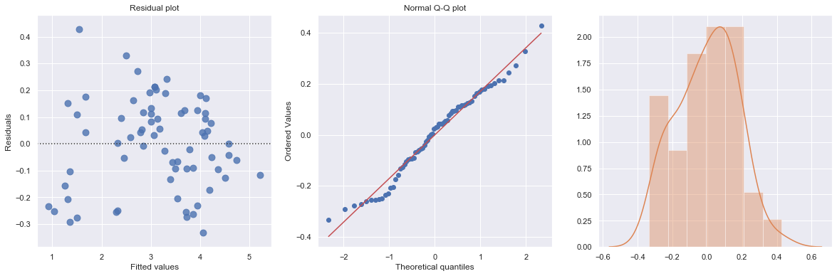
[54]:
df = pd.read_csv(dataurl+'costunits.csv', header=0, index_col='month')
fit2 = np.poly1d(np.polyfit(df.units, df.cost, 2))
xp = np.linspace(np.min(df.units), np.max(df.units), 100)
fig = plt.figure(figsize=(8,6))
plt.plot(df.units, df.cost, '.', xp, fit2(xp), '-')
plt.title('cost vs units')
plt.xlabel('units')
plt.ylabel('cost')
plt.show()

toggle()
[54]:
[55]:
df = pd.read_csv(dataurl+'costunits.csv', header=0, index_col='month')
df['units2'] = np.power(df.units,2)
result = ols(formula='cost ~ units + units2', data=df).fit()
display(result.summary())
fig, axes = plt.subplots(1,3,figsize=(18,6))
sns.residplot(result.fittedvalues, result.resid , lowess=False, scatter_kws={"s": 80},
              line_kws={'color':'r', 'lw':1}, ax=axes[0])
axes[0].set_title('Residual plot')
axes[0].set_xlabel('Fitted values')
axes[0].set_ylabel('Residuals')

axes[1].relim()
stats.probplot(result.resid, dist='norm', plot=axes[1])
axes[1].set_title('Normal Q-Q plot')
axes[2].relim()
sns.distplot(result.resid, ax=axes[2]);
plt.show()
toggle()
| Dep. Variable: | cost | R-squared: | 0.822 |
|---|---|---|---|
| Model: | OLS | Adj. R-squared: | 0.811 |
| Method: | Least Squares | F-statistic: | 75.98 |
| Date: | Wed, 14 Aug 2019 | Prob (F-statistic): | 4.45e-13 |
| Time: | 08:55:25 | Log-Likelihood: | -327.88 |
| No. Observations: | 36 | AIC: | 661.8 |
| Df Residuals: | 33 | BIC: | 666.5 |
| Df Model: | 2 | ||
| Covariance Type: | nonrobust |
| coef | std err | t | P>|t| | [0.025 | 0.975] | |
|---|---|---|---|---|---|---|
| Intercept | 5792.7983 | 4763.058 | 1.216 | 0.233 | -3897.717 | 1.55e+04 |
| units | 98.3504 | 17.237 | 5.706 | 0.000 | 63.282 | 133.419 |
| units2 | -0.0600 | 0.015 | -3.981 | 0.000 | -0.091 | -0.029 |
| Omnibus: | 2.245 | Durbin-Watson: | 2.123 |
|---|---|---|---|
| Prob(Omnibus): | 0.326 | Jarque-Bera (JB): | 2.021 |
| Skew: | -0.553 | Prob(JB): | 0.364 |
| Kurtosis: | 2.651 | Cond. No. | 5.12e+06 |
Warnings:
[1] Standard Errors assume that the covariance matrix of the errors is correctly specified.
[2] The condition number is large, 5.12e+06. This might indicate that there are
strong multicollinearity or other numerical problems.
[55]:
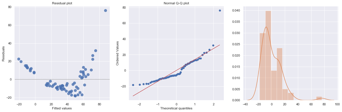
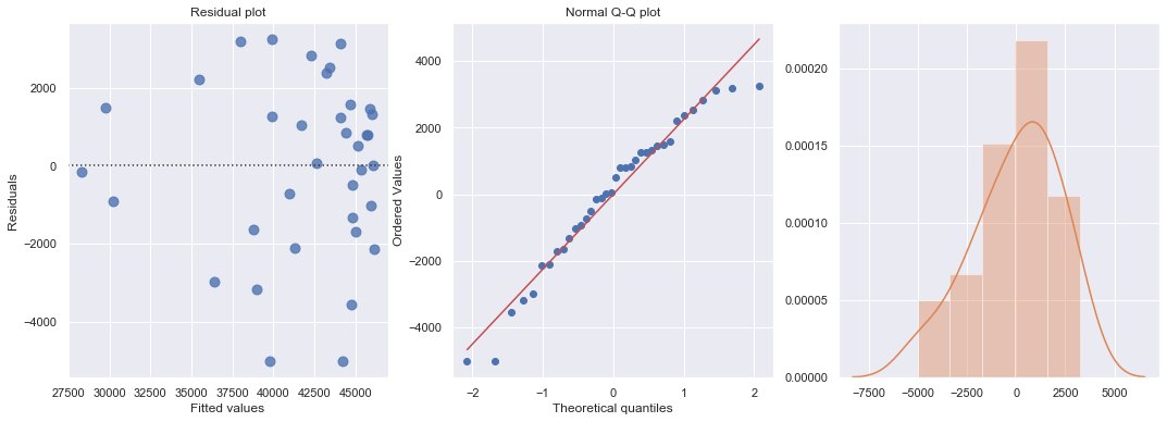
[56]:
df = pd.read_csv(dataurl+'carstopping.txt', delim_whitespace=True, header=0)
df['sqrtdist'] = np.sqrt(df.StopDist)
result = ols(formula='sqrtdist ~ Speed', data=df).fit()
fig, axes = plt.subplots(1,3,figsize=(18,5))
sns.residplot(result.fittedvalues, result.resid , lowess=False, scatter_kws={"s": 80},
              line_kws={'color':'r', 'lw':1}, ax=axes[0])
axes[0].set_title('Residual plot')
axes[0].set_xlabel('Fitted values')
axes[0].set_ylabel('Residuals')

axes[1].relim()
stats.probplot(result.resid, dist='norm', plot=axes[1])
axes[1].set_title('Normal Q-Q plot')
axes[2].relim()
sns.distplot(result.resid, ax=axes[2]);
plt.show()

toggle()
[56]:
Heteroscedasticity
Excessive nonconstant variance can create technical difficulties with a multiple linear regression model. For example, if the residual variance increases with the fitted values, then prediction intervals will tend to be wider than they should be at low fitted values and narrower than they should be at high fitted values. Some remedies for refining a model exhibiting excessive nonconstant variance includes the following:
Apply a variance-stabilizing transformation to the response variable, for example a logarithmic transformation (or a square root transformation if a logarithmic transformation is “too strong” or a reciprocal transformation if a logarithmic transformation is “too weak”).
Weight the variances so that they can be different for each set of predictor values. This leads to weighted least squares, in which the data observations are given different weights when estimating the model – see below.
A generalization of weighted least squares is to allow the regression errors to be correlated with one another in addition to having different variances. This leads to generalized least squares, in which various forms of nonconstant variance can be modeled.
For some applications we can explicitly model the variance as a function of the mean, E(Y). This approach uses the framework of generalized linear models.
[57]:
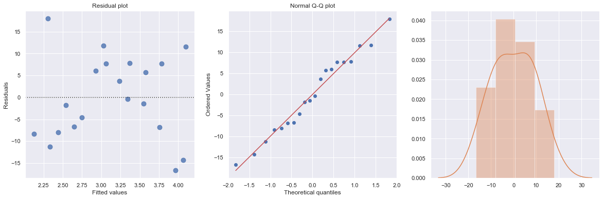
df = pd.read_csv(dataurl+'ca_learning.txt', sep='\s+', header=0)
result = analysis(df, 'cost', ['responses'], printlvl=4)
| Dep. Variable: | cost | R-squared: | 0.889 |
|---|---|---|---|
| Model: | OLS | Adj. R-squared: | 0.878 |
| Method: | Least Squares | F-statistic: | 80.19 |
| Date: | Wed, 14 Aug 2019 | Prob (F-statistic): | 4.33e-06 |
| Time: | 08:55:27 | Log-Likelihood: | -34.242 |
| No. Observations: | 12 | AIC: | 72.48 |
| Df Residuals: | 10 | BIC: | 73.45 |
| Df Model: | 1 | ||
| Covariance Type: | nonrobust |
| coef | std err | t | P>|t| | [0.025 | 0.975] | |
|---|---|---|---|---|---|---|
| Intercept | 19.4727 | 5.516 | 3.530 | 0.005 | 7.182 | 31.764 |
| responses | 3.2689 | 0.365 | 8.955 | 0.000 | 2.456 | 4.082 |
| Omnibus: | 2.739 | Durbin-Watson: | 1.783 |
|---|---|---|---|
| Prob(Omnibus): | 0.254 | Jarque-Bera (JB): | 1.001 |
| Skew: | 0.038 | Prob(JB): | 0.606 |
| Kurtosis: | 1.587 | Cond. No. | 63.1 |
Warnings:
[1] Standard Errors assume that the covariance matrix of the errors is correctly specified.
standard error of estimate:4.59830
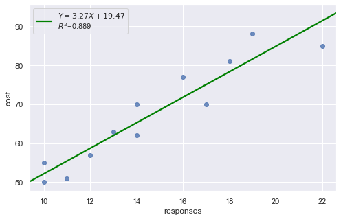
KstestResult(statistic=0.4553950067071834, pvalue=0.008567457152187175)
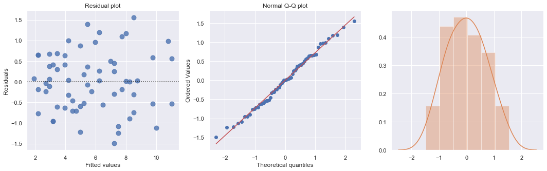
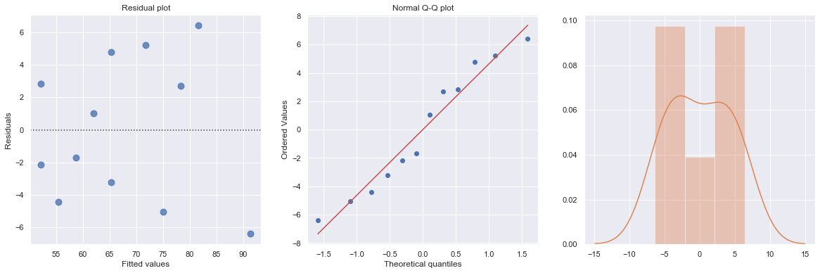
A plot of the residuals versus the predictor values indicates possible nonconstant variance since there is a very slight “megaphone” pattern. We therefore fit a simple linear regression model of the absolute residuals on the predictor and calculate weights as 1 over the squared fitted values from this model.
[58]:
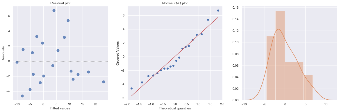
result_ols = ols(formula='cost ~ responses', data=df).fit()
df['resid'] = abs(result_ols.resid)
result = ols(formula='resid ~ responses', data=df).fit()
X = sm.add_constant(df.responses)
w = 1./(result.fittedvalues ** 2)
result_wls = sm.WLS(df.cost, X, weights=w).fit()
display(result_wls.summary())
fig, axes = plt.subplots(1,3,figsize=(18,5))
sns.residplot(result_wls.fittedvalues, result_wls.wresid, lowess=False, scatter_kws={"s": 80},
line_kws={'color':'r', 'lw':1}, ax=axes[0])
axes[0].set_title('Residual plot')
axes[0].set_xlabel('Fitted values')
axes[0].set_ylabel('Residuals')
axes[1].relim()
stats.probplot(result_wls.resid, dist='norm', plot=axes[1])
axes[1].set_title('Normal Q-Q plot')
axes[2].relim()
sns.distplot(result_wls.resid, ax=axes[2]);
plt.show()
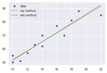
x = np.linspace(np.min(df.responses), np.max(df.responses), 20)
y_wls = result_wls.params[0] + result_wls.params[1] * x
y_ols = result_ols.params[0] + result_ols.params[1] * x
plt.plot(df.responses, df.cost, 'o', label='data')
plt.plot(x, y_ols, '-', label='ols method')
plt.plot(x, y_wls, '-', label='wls method')
plt.legend()
plt.show()
toggle()
| Dep. Variable: | cost | R-squared: | 0.895 |
|---|---|---|---|
| Model: | WLS | Adj. R-squared: | 0.885 |
| Method: | Least Squares | F-statistic: | 85.35 |
| Date: | Wed, 14 Aug 2019 | Prob (F-statistic): | 3.27e-06 |
| Time: | 08:55:28 | Log-Likelihood: | -33.248 |
| No. Observations: | 12 | AIC: | 70.50 |
| Df Residuals: | 10 | BIC: | 71.47 |
| Df Model: | 1 | ||
| Covariance Type: | nonrobust |
| coef | std err | t | P>|t| | [0.025 | 0.975] | |
|---|---|---|---|---|---|---|
| const | 17.3006 | 4.828 | 3.584 | 0.005 | 6.544 | 28.058 |
| responses | 3.4211 | 0.370 | 9.238 | 0.000 | 2.596 | 4.246 |
| Omnibus: | 4.602 | Durbin-Watson: | 1.706 |
|---|---|---|---|
| Prob(Omnibus): | 0.100 | Jarque-Bera (JB): | 1.241 |
| Skew: | 0.062 | Prob(JB): | 0.538 |
| Kurtosis: | 1.429 | Cond. No. | 56.7 |
Warnings:
[1] Standard Errors assume that the covariance matrix of the errors is correctly specified.
[58]: