[1]:
%run initscript.py
%run ./files/loaddatfuncs.py
HTML("""
<div id="popup" style="padding-bottom:5px; display:none;">
    <div>Enter Password:</div>
    <input id="password" type="password"/>
    <button onclick="done()" style="border-radius: 12px;">Submit</button>
</div>
<button onclick="unlock()" style="border-radius: 12px;">Unclock</button>
<a href="#" onclick="code_toggle(this); return false;">show code</a>
""")
[1]:
Exploring Data
Data Description
Data and information are so prevalent in our lives today, that it is known as the “Information Age”. Being literate today means not just being able to read, but being able to understand the massive amount of information thrown at us every day – much of it on the computer. Statistics is the science of making effective use of numerical data. It deals with all aspects of data, including the collection, analysis and interpretation of data. However, it can be easily misinterpreted and manipulated if we don’t do it carefully. As Mark Twain said
\begin{equation} \text{"There are lies, damned lies, and statistics."} \nonumber \end{equation}
Percentage
Percentage is the most frequently used concept in business analytics because of many uncertainties in today’s complex business environment. But many times people use it without really understanding its meaning.

Percentage is a relative terminology. It is always important to ask “percentage of what” as shown in this simple example.
… of what?
Pay: $10,000 per month.
“Sorry guys. You have to have a 10% pay cut.”
Pay: $9,000 per month.
“Now I can give you a 10% pay rise.”
Pay: $9,900 per month.
What does “60% sure or confidence” mean?
This is about probability. If we flip a coin 100 times and see the head 60 times, then we could say that we are 60% sure that next toss will show a head.
If someone says “I have 60% confidence that this campaign will increase sales”, the statistical meaning is that if a decision maker can try 100 times under current business environment, s/he may see a sales increase for 60 times.
Question 1:
There are 3 sequences (each of them has 10 symbols with 6 Xs and 4 Os):
OXXOXOXOXX
XXOXOOXXXO
XOXXOXOXOX
Predict the next symbol for those 3 sequences
1-O, 2-X, 3-O
1-X, 2-X, 3-X
1-O, 2-O, 3-O
1-X, 2-O, 3-X
[2]:
hide_answer()
[2]:
B is correct.
A psychology experiment gives subjects a random series of \(X\)s and \(O\)s and asks them to predict what the next one will be. For instance, they may see:
\begin{equation} OXXOXOXOXOXXOOXXOXOXXXOXX \nonumber \end{equation}
Most people realize that there are slightly more \(X\)s than \(O\)s — if you count, you’ll see it’s 60 percent \(X\)s, 40 percent \(O\)s — so they guess \(X\) most of the time, but throw in some \(O\)s to reflect that balance.
However, if you want to maximize your chances of a correct prediction, you would always choose \(X\). Then you would be right 60 percent of the time.
If you randomize 60/40, as most participants do, your prediction ends up being correct 52 percent of the time only slightly better than if you had not bothered to assess relative frequencies of \(X\)s and \(O\)s and instead just guessed one or the other (50/50).
Why 52%?
Sixty percent of the time you choose X and are correct 60 percent of the time, while 40 percent of the time you choose O and are correct only 40 percent of the time. On average, this is \(0.6^2 + 0.4^2 = 0.52\)
\(\blacksquare\)
Question 2:
The chance a baby will be a boy (or girl) is 50%. There are two hospitals:
A - 45 births per day
B - 15 births per day
Which hospital would have more days when 60% or more of the babies born are boys?
Hospital A
Hospital B
Equal chance
Uncertain
[3]:
hide_answer()
[3]:
Again, B is correct.
The smaller hospital is correct because the larger the number of events (in this case, births), the likelier each daily outcome will be close to the average (in this case, 50 percent).
To see how this works, imagine you are flipping coins. You are more likely to get heads every time if you flip 5 coins than if you flip 50 coins.
Thus, the smaller hospital — precisely because it has fewer births — is more likely to have more extreme outcomes away from the average.
\(\blacksquare\)
Average
If you were a real-estate agent and trying to convince people to move into a particular neighborhood. You could, with perfect honesty and “truthfulness” tell different people that the average income in the neighborhood is: a), b) or c).

because we have mean, median and mode to characterize the central tendency.

Data Visualization
If your goal is to lie, cheat, manipulate, or mislead, Graphical Displays are your friend…

Example 1:

Example 2:

Example 3:

Example 4:

As “Statistics is the art of never having to say you’re wrong”, I would like to recommend a book

Case: NYC Parking Violation
We consider packing violation data in NYC from August 2013 to June 2014. The dataset is available in NYC Open Data. The website NYC Open Data is a collection of 750 New York City public datasets made available by city agencies and organizations.
The original dataset has 9.1M rows and 43 columns with size more than 1G. The dataset used in this note is already filtered with only hydrant paking violations. The excel file can be downloaded from this link.
[4]:
df_park = pd.read_csv(dataurl+'Parking_Violations.csv', parse_dates=['Time'])

# run pivot table
df_pivot = df_park[(df_park['Street Code1']!=0) &\
                   (df_park['Street Code2']!=0) &\
                   (df_park['Street Code2']!=0)].pivot_table(values='Summons Number',
                                                  index='Address',
                                                  margins=False,
                                                  aggfunc='count').sort_values(by='Summons Number',
                                                                               ascending=False).head(10)
df_pivot['ticket'] = df_pivot['Summons Number']
df_pivot['fine'] = df_pivot['ticket']*115
df_pivot = df_pivot.drop(['Summons Number'], axis=1)

toggle()
[4]:
Show the first 5 rows of the dataset
[5]:
df_park.head()
[5]:
| Summons Number | Registration State | Issue Date | Vehicle Body Type | Street Code1 | Street Code2 | Street Code3 | Vehicle Make | Violation Time | Violation County | Vehicle Color | Vehicle Year | Time | Address | |
|---|---|---|---|---|---|---|---|---|---|---|---|---|---|---|
| 0 | 1356906515 | NY | 9/18/1971 | SDN | 13610 | 37270 | 37290 | MAZDA | 0914P | NY | BLK | 2010 | 9:14 PM | 4165 BROADWAY |
| 1 | 1365454538 | NY | 2/12/1976 | VAN | 37290 | 10740 | 10940 | TOYOT | 0458A | Q | BLK | 2007 | 4:58 AM | 49-11 BROADWAY |
| 2 | 1355329360 | NY | 12/9/1990 | SUBN | 35290 | 31240 | 31290 | FORD | 0902A | Q | BK | 2003 | 9:02 AM | 4402 BEACH CHANNEL DR |
| 3 | 1364794688 | NY | 1/12/1991 | SUBN | 27106 | 9340 | 9540 | ME/BE | 0223P | Q | SILVE | 2005 | 2:23 PM | 40-30 235 ST |
| 4 | 1357592103 | NY | 1/4/2000 | SDN | 0 | 40404 | 40404 | NISSA | 1045P | R | SILVE | 2008 | 10:45 PM | 140 LUDWIGE LANE |
The top 10 hydrants that collect most of the tickets. Note that the fine for hydrant parking violation is $115. So the column “fine” is the revenue generated by each hydrant and the total fine of the top 10 hydrants is $144,440.
[6]:
print('Total annual revenue of top 10 hydrants', df_pivot.fine.sum())
df_pivot
Total annual revenue of top 10 hydrants 144440
[6]:
| ticket | fine | |
|---|---|---|
| Address | ||
| 152 Forsyth St | 179 | 20585 |
| 104 Forsyth St | 137 | 15755 |
| 100 Overlook Ter | 135 | 15525 |
| 720 Lenox Ave | 127 | 14605 |
| 122 Montague St | 126 | 14490 |
| 21 W 58th St | 125 | 14375 |
| 2960 Fredrick Douglas Blv | 119 | 13685 |
| 44 Court St | 114 | 13110 |
| 1498 3rd Ave | 99 | 11385 |
| 41-28 Main St | 95 | 10925 |
[7]:
axes = df_pivot.plot.pie(y='ticket', autopct='%1.1f%%', figsize=(5, 5))
axes.legend(loc='best', bbox_to_anchor=(2,.8))
axes.set_ylabel('')
plt.show()
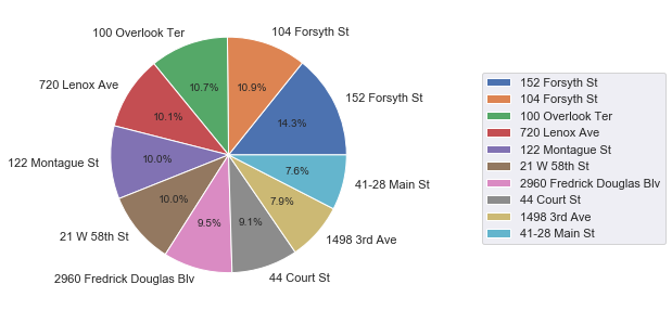
The most “valuable” hydrant is shown in google street view
[8]:
IFrame('https://www.google.com/maps/embed?pb=!4v1557893815788!6m8!1m7!1s_SBRnIVor2FDGiszffialA!2m2!1d40.\
72061441911959!2d-73.99172978854598!3f288.92!4f0!5f0.7820865974627469', width=700, height=400)
[8]:
However, according to NYC department of transportation (DOT), this may not be considered as a parking violation.

The issue is first spotted by Ben Wellington who is the author of blog I Quant NY. It certainly has impacts on NYC DOT. Today, the google street map shows
[9]:
IFrame('https://www.google.com/maps/embed?pb=!4v1557932957501!6m8!1m7!1s04LptdatMEwvnW3J_tjGvw!2m2!1d40.\
72061130331954!2d-73.99171284164994!3f264.0115330665066!4f-27.9676492146982!5f0.7820865974627469', width=700, height=400)
[9]:
Statistical Inferences
Generally, statistical inferences are of two types: confidence interval estimation and hypothesis testing.
Interval Estimation
In confidence interval estimation, data are used to obtain a point estimate and a confidence interval takes the form
Point Estimate \(\pm\) Multiple \(\times\) Standard Error
Hypothesis Testing
Statistical Significance
When you run an experiment, conduct a survey, take a poll, or analyze a set of data, you’re taking a sample of some population of interest, not looking at every single data point that you possibly can. Statistical significance helps quantify whether a result is likely due to chance or to some factor of interest. When a finding is (statistically) significant, it simply means you can feel confident that’s it real, not that you just got lucky (or unlucky) in choosing the sample.
The Process of Evaluating
No matter what you’re studying, the process for evaluating significance is the same.
Establish a null hypothesis
Establish a straw man that you’re trying to disprove. For example, in an experiment of a marketing campaign, the null hypothesis might be “on average, customers don’t prefer our new campaign to the old one”. In an experiment of introducing new surgical intervention, the null hypothesis might be “the new surgical intervention cannot reduce the number of patient deaths”.
Set a target and interpret p-value.
The significance level is an expression of how rare your results are, under the assumption that the null hypothesis is true. It is usually expressed as a p-value, and the lower the p-value, the less likely the results are due purely to chance. Setting a target can be dauntingly complex and depends on what we are analyzing. For the surgical intervention, we may want an every low p-value (such as 0.001) to be conservative. But if we are testing for whether the new marketing concept is better, we probably willing to take a higher value (such as 0.2).
Collect data.
Plot the results.
The graph will help us to understand the variation, sampling error and statistical significance.
Calculate statistics.
After the process, we want to know if the findings are “significant”. However, a statistically significant result is not necessarily of practical importance because
Practical significance is business relevance
Statistical significance is the confidence that a result isn’t due purely to chance
Give an example that statistical significance is not practical significance.
[10]:
hide_answer()
[10]:
Example: Weight-Loss Program
Researchers are studying a new weight-loss program. Using a large sample they construct a \(95%\) confidence interval for the mean amount of weight loss after six months on the program to be \([0.12, 0.20]\).
All measurements were taken in pounds. Note that this confidence interval does not contain \(0\), so we know that their results were statistically significant at a \(0.05\) alpha level.
However, most people would say that the results are not practically significant because after six months on a weight-loss program we would want to lose more than \(0.12\) to \(0.20\) pounds.
\(\blacksquare\)
Case: Surgical Intervention
We need to decide whether a new surgical intervention is more appropriate for a cancer patient with a brain tumor compared to the standard chemotherapy treatment:
Hypothetical result 1: The new surgical intervention significantly reduced the number of patient deaths compared to the current standard chemotherapy treatment (p=0.04)
Evaluate the result?
[11]:
hide_answer()
[11]:
What is significant?
Do the analysts mean considerably fewer deaths or just statistically significant fewer deaths?
It is not clear, but possibly just the latter, since the p-value is reported. Here, we don’t have any information on exactly how superior the new surgical intervention was compared to chemotherapy.
\(\blacksquare\)
Hypothetical result 2: The new surgical intervention significantly reduced the number of patient deaths compared to the current standard chemotherapy treatment (p=0.04). After five years, there were two fewer deaths in the intervention group.
Evaluate the result?
[12]:
hide_answer()
[12]:
Now the exact difference in number of deaths is provided and it is clear the word “significantly” refers to statistical significance in this case, since two is not a large difference.
As a manager, it is now important to contextualize these results.
In an exploratory study in which each group had only 10 participants, two fewer deaths in the intervention group would be meaningful and warrant further investigation.
In a large clinical trial with 1000 participants in each group, two fewer deaths, even if statistically significant, is less impressive. In this case, we would consider the two interventions more or less equal and base our treatment decision on other factors.
\(\blacksquare\)
Hypothetical result 3: The new surgical intervention did not statistically significantly reduce the number of patient deaths compared to the current standard chemotherapy treatment (p=0.07). After five years, there was 1 death in the surgical intervention group and 9 deaths in the standard chemotherapy group.
Evaluate the result?
[13]:
hide_answer()
[13]:
This time we have a statistically non–significant result that corresponds to a seemingly large point estimate (8 fewer deaths).
In this case, it appears the treatment has an important effect but perhaps the study lacks sufficient power for this difference to be statistically significant.
Again, we need more information about the size of the trial to contextualize the results. To simply conclude by virtue of statistical hypothesis testing that this study shows no difference between groups would seem inappropriate.
\(\blacksquare\)
Case: Market Campaign
The marketing department comes up with a new concept and you want to see if it works better than the current one. You can’t show it to every single target customer, of course, so you choose a sample group. When you run the results, you find that those who saw the new campaign spent $10.17 on average, more than the $8.41 those who saw the old one spent.
This $1.76 might seem like a big — and perhaps important — difference. But in reality you may have been unlucky, drawing a sample of people who do not represent the larger population; in fact, maybe there was no difference between the two campaigns and their influence on consumers’ purchasing behaviors. This is called a sampling error, something you must contend with in any test that does not include the entire population of interest.
What causes sampling error?
[14]:
hide_answer()
[14]:
There are two main contributors to sampling error the size of the sample and the variation in the underlying population.
sample size follows our intuition:
All else being equal, we will feel more comfortable in the accuracy of the campaigns’ $1.76 difference if you showed the new one to 1,000 people rather than just 25. Of course, showing the campaign to more people costs more, so you have to balance the need for a larger sample size with your budget.
The same is true of statistical significance: with bigger sample sizes, you’re less likely to get results that reflect randomness. Thus, a small difference, which may not be practical significance, can be statistical significance.
variation is a little trickier to understand. 
In the graph, each plot expresses a different possible distribution of customer purchases under the campaign. The plot with less variation: most people spend roughly the same amount of dollars. Some people spend a few dollars more or less, but if you pick a customer at random, chances are pretty good that they’ll be pretty close to the average. So it’s less likely that you’ll select a sample that looks vastly different from the total population, which means you can be relatively confident in your results.
The plot with more variation: people vary more widely in how much they spend. The average is still the same, but quite a few people spend more or less. If you pick a customer at random, chances are higher that they are pretty far from the average. So if you select a sample from a more varied population, you can’t be as confident in your results.
To summarize, the important thing to understand is that the greater the variation in the underlying population, the larger the sampling error.
\(\blacksquare\)
Should we adopt the new campaign? Evaluate the new campaign in different scenarios.
[15]:
hide_answer()
[15]:
The new marketing campaign shows a $1.76 increase (more than 20%) in average sales. If the p-values is 0.02, then the result is also statistically significant, and we should adopt the new campaign.
If the p-value comes in at 0.2 the result is not statistically significant, but since the boost is so large we’ll likely still proceed, though perhaps with a bit more caution.
But what if the difference were only a few cents? If the p-value comes in at 0.2, we’ll stick with your current campaign or explore other options. But even if it had a significance level of 0.01, the result is likely real, though quite small. In this case, our decision probably will be based on other factors, such as the cost of implementing the new campaign.
\(\blacksquare\)
Advice to Managers
How to evaluate?
[16]:
hide_answer()
[16]:
Although software will report statistical significance, it’s still helpful to know the process described above in order to understand and interpret the results because Managers should not trust a model they don’t understand.
\(\blacksquare\)
How do managers use it?
[17]:
hide_answer()
[17]:
Companies use statistical significance to understand how strongly the results of an experiment they’ve conducted should influence the decisions they make.
Managers want to know what findings say about what they should do in the real world. But confidence intervals and hypothesis tests were designed to support science, where the idea is to learn something that will stand the test of time.
So rather than obsessing about whether your findings are precisely right, think about the implication of each finding for the decision you’re hoping to make. What would you do differently if the finding were different?
\(\blacksquare\)
What mistakes do managers make?
[18]:
hide_answer()
[18]:
The word “significant” is often used in businesses to mean whether a finding is strategically important. When you look at results of a survey or experiment, ask about the statistical significance if the analyst hasn’t reported it.
Statistical significance tests help you account for potential sampling errors, but what is often more worrisome is the non-sampling error. Non-sampling error involves things where the experimental and/or measurement protocols didn’t happen according to plan, such as people lying on the survey, data getting lost, or mistakes being made in the analysis.
Keep in mind the practical application of the findings.
Be all for using statistics, but always wed it with good judgment.
\(\blacksquare\)
Estimating Relationships
The relationship between circumference and diameter is known to follow the exact equation
\begin{equation} \text{circumference $= \pi$ $\times$ diameter} \end{equation}
However, such a deterministic (or functional) relationship is not our interests. We are interested in statistical relationships, in which the relationship between the variables is not perfect. For example, we might be interested in the relationship between rainfall and product sales, or between the mortality due to skin cancer and state latitude.
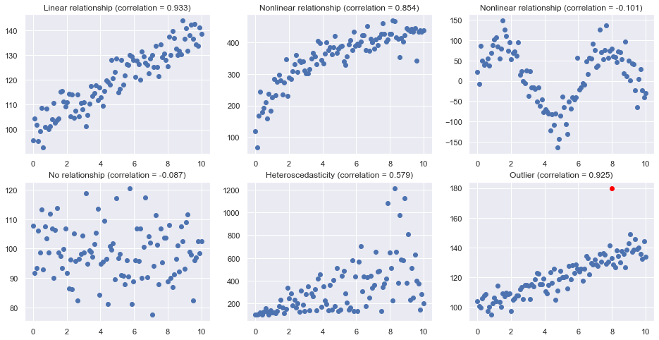
Scatterplots provide graphical indications of relationships, whether they are linear, non-linear or even nonexistent. Correlation \(\rho\) is a numerical summary measures that indicate the strength of linear relationships between pairs of variables.
If \(\rho\) = -1, then there is a perfect negative linear relationship between \(X\) and \(Y\).
If \(\rho\) = 1, then there is a perfect positive linear relationship between \(X\) and \(Y\).
If \(\rho\) = 0, then there is no linear relationship between \(X\) and \(Y\).
Scatterplots are useful for indicating linear relationships and demonstrate its strength visually. However, they do not quantify the relationship. For example, a scatterplot could show a strong positive relationship between rainfall and product sales. But a scatterplot does not specify exactly what this relationship is. For example, what is the sales amount if the rainfall is, says, 4 inches?
Scatterplots
Here are some typical scatterplots
[19]:
size=100
nrows=2
ncols=3

np.random.seed(123)

plt.subplots(nrows, ncols, figsize = (16,8))
plt.subplot(nrows, ncols, 1)
x = np.linspace(0, 10, size)
y = 100 + 4*x+ 4*np.random.normal(size=size)
plt.title("Linear relationship (correlation = {:.3f})".format(np.corrcoef(x,y)[0,1]))
plt.plot(x, y, 'o');
plt.subplot(nrows, ncols, 2)
x = np.linspace(0, 10, size)
y = 100 + 100*np.log(3*x+1)+ 30*np.random.normal(size=size)
plt.title("Nonlinear relationship (correlation = {:.3f})".format(np.corrcoef(x,y)[0,1]))
plt.plot(x, y, 'o');
plt.subplot(nrows, ncols, 3)
x = np.linspace(0, 10, size)
y = 100*np.sin(x) + 30*np.random.normal(size=size)
plt.title("Nonlinear relationship (correlation = {:.3f})".format(np.corrcoef(x,y)[0,1]))
plt.plot(x, y, 'o');
plt.subplot(nrows, ncols, 4)
x = np.linspace(0, 10, size)
y = 100 + 10*np.random.normal(size=size)
plt.title("No relationship (correlation = {:.3f})".format(np.corrcoef(x,y)[0,1]))
plt.plot(x, y, 'o');
plt.subplot(nrows, ncols, 5)
x = np.linspace(0, 10, size)
y = 100 + 3*x+ abs(50*x*np.random.normal(size=size))
plt.title("Heteroscedasticity (correlation = {:.3f})".format(np.corrcoef(x,y)[0,1]))
plt.plot(x, y, 'o');
plt.subplot(nrows, ncols, 6)
x = np.linspace(0, 10, size)
y = 100 + 4*x+ 5*np.random.normal(size=size)
plt.title("Outlier (correlation = {:.3f})".format(np.corrcoef(x,y)[0,1]))
plt.plot(x, y, 'o');
plt.plot(8, 180, 'o', c='red')

plt.show()

toggle()
[19]:
Correlation
correlation only quantifies the strength of a linear relationship (see example in section of R-squared).
correlation can be greatly affected by just one data point (see example in section of R-squared).
correlation can be greatly affected after aggregation.
[20]:
age   = [10, 10, 20, 20, 30]
score = [15, 39, 20, 43, 35]
df = pd.DataFrame({'age':age,'score':score})
print('Data:\n',df)
print('correlation:',np.corrcoef(df.age, df.score)[0,1], '\n')

df = df.groupby('age').mean().reset_index()
print('Aggregated Data:\n',df)
print('correlation:',np.corrcoef(df.age, df.score)[0,1])
toggle()
Data:
    age  score
0   10     15
1   10     39
2   20     20
3   20     43
4   30     35
correlation: 0.27831712743147

Aggregated Data:
    age  score
0   10   27.0
1   20   31.5
2   30   35.0
correlation: 0.9974059619080593
[20]:
Freedman, Pisani and Purves (1997) investigated data from the 1988 Current Population Survey and considered the relationship between a man’s level of education and his income. They calculated the correlation between education and income in two ways:
First, they treated individual men, aged 25-64, as the experimental units. That is, each data point represented a man’s income and education level. Using these data, they determined that the correlation between income and education level for men aged 25-64 was about 0.4, not a convincingly strong relationship.
The statisticians analyzed the data again, but in the second go-around they treated nine geographical regions as the units. That is, they first computed the average income and average education for men aged 25-64 in each of the nine regions. They determined that the correlation between the average income and average education for the sample of n = 9 regions was about 0.7, obtaining a much larger correlation than that obtained on the individual data.
The correlation calculated on the region data tends to overstate the strength of an association. How do you know what kind of data to use — aggregate data (such as the regional data) or individual data? It depends on the conclusion you’d like to make.
If you want to learn about the strength of the association between an individual’s education level and his/her income, then by all means you should use individual data. On the other hand, if you want to learn about the strength of the association between a school’s average salary level and the schools graduation rate, you should use aggregate data in which the units are the schools.
Case: Sales Prediction
Suppose we are trying to predict next month’s sales. We probably know a lots of factors from the weather to a competitor’s promotion to the rumor of a new and improved model can impact the sales. Perhaps your colleagues even have theories: “Trust me. The more rain we have, the more we sell” or “Six weeks after the competitor’s promotion, sales jump”.
To perform a regression analysis, the first step is to gather the data on the variables in question. Suppose we have all of monthly sales number for the past three years and some independent variables we are interested in. Let’s say we consider the average monthly rainfall for the past three years as one of the independent variables.
Glancing at this data, the sales are higher on days when it rains a lot, but by how much? The regression line can answer this question. In addition to the line, we also have a formula in the form of \begin{equation} Y = a + b X \nonumber \end{equation}
The formula shows - Historically, when it didn’t rain, we made an average of \(a\) sales, and - in the past, for every additional inch of rain, we made an average of \(b\) more sales.
However, regression is not perfectly precise to model the real world so the formula we need keep in mind is
\begin{equation} Y = a + b X + \text{residual}\nonumber \end{equation}
where residual is the vertical distance from a point to the line.
[21]:
LinRegressDisplay().container
Case: Skin Cancer
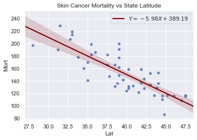
The data includes the mortality due to skin cancer (number of deaths per 10 million people) and the latitude (degrees North) at the center of each of 49 states in the U.S. (The data were compiled in the 1950s, so Alaska and Hawaii were not yet states, and Washington, D.C. is included in the data set even though it is not technically a state.)
The scatterplot suggests that if you lived in the higher latitudes of the northern U.S., the less exposed you’d be to the harmful rays of the sun, and therefore, the less risk you’d have of death due to skin cancer. There appears to be a negative linear relationship between latitude and mortality due to skin cancer, but the relationship is not perfect. Indeed, the plot exhibits some “trend,” but it also exhibits some “scatter.” Therefore, it is a statistical relationship, not a deterministic one.
[22]:
df = pd.read_csv(dataurl+'skincancer.txt', sep='\s+', header=0)
slope, intercept, r_value, p_value, std_err = stats.linregress(df.Lat,df.Mort)
sns.regplot(x=df.Lat, y=df.Mort, data=df, marker='o',
line_kws={'color':'maroon',
'label':"$Y$"+"$={:.2f}X+{:.2f}$".format(slope, intercept)},
scatter_kws={'s':20})
plt.legend()
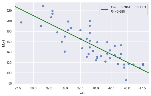
plt.title('Skin Cancer Mortality vs State Latitude')
plt.show()
toggle()
[22]:
[23]:
df = pd.read_csv(dataurl+'skincancer.txt', sep='\s+', header=0)
result = analysis(df, 'Mort', ['Lat'], printlvl=1)
[24]:
df = pd.read_csv(dataurl+'alligator.txt', sep='\s+', header=0)
result = analysis(df, 'weight', ['length'], printlvl=1)
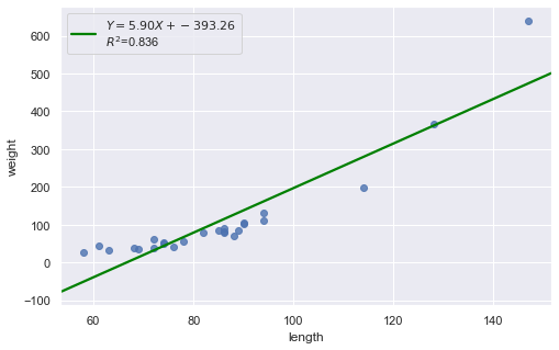
Consider the above two plots where one is about skin cancer mortality, and the other is about the weight and length of alligators. What is your assessment?
[25]:
hide_answer()
[25]:
It appears as if the relationship between latitude and skin cancer mortality is indeed linear, and therefore it would be best if we summarized the trend in the data using a linear function.
However, for the dataset of alligators, a a curved function would more adequately describe the trend. The scatter plot gives us a pretty good indication that a linear model is inadequate in this case.
\(\blacksquare\)